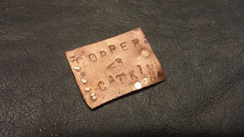
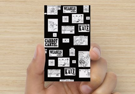
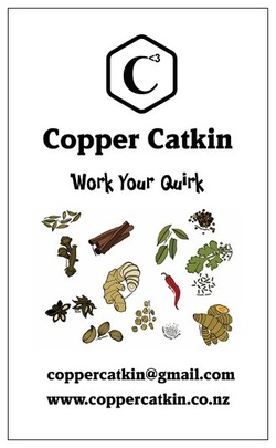
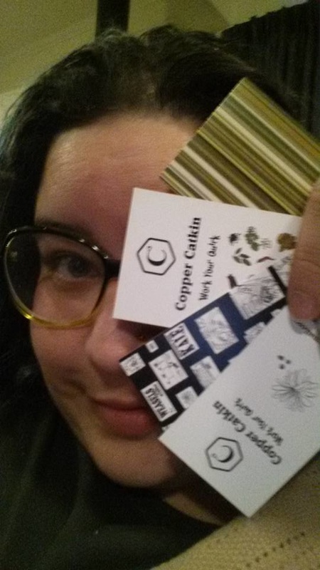
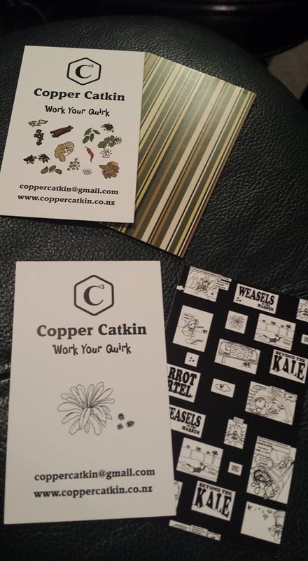
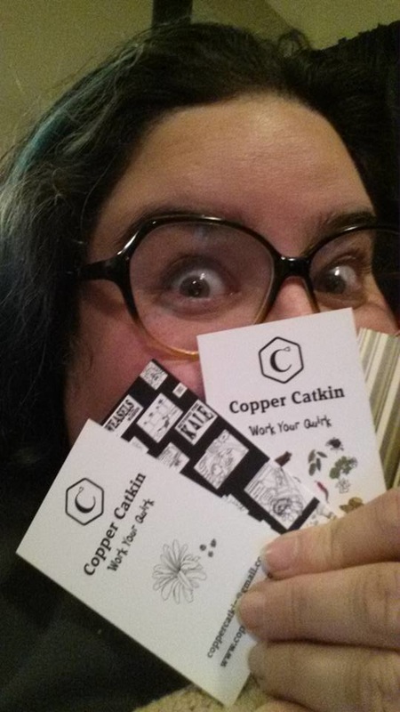
That’s right, we’ve got a logo, a nifty little tagline, and now, business cards! As the Geordie Shore lot like to say, GET IN!
The saga of the logo
The logo has been a bit of an adventure, actually.
I came up with the ‘Copper Catkin’ part of the name some time ago – the contradiction appealed to me – the fluffy catkin, made of shiny metal. I chose copper as a nod to my interest in all things Steampunk, and I have loved catkins since I was a wee kitling myself. The combination plant and metal is also a quiet nod to NZ’s silver fern.
I came up with the ‘Copper Catkin’ part of the name some time ago – the contradiction appealed to me – the fluffy catkin, made of shiny metal. I chose copper as a nod to my interest in all things Steampunk, and I have loved catkins since I was a wee kitling myself. The combination plant and metal is also a quiet nod to NZ’s silver fern.
As I played with the name, I knew I was at risk of choosing another name that didn’t reflect my brand, which was something people commented about with Phersu Dancing.
I tried adding in a third word – ‘Copper Catkin Clothing’? ‘Copper Catkin Creations’? ‘Copper Catkin Compulsion’? ‘Clothing by Copper Catkin’? I just couldn’t get the name to gel correctly.
As I always do these days, I talked it out with my husband – and he came back with a really clever suggestion.
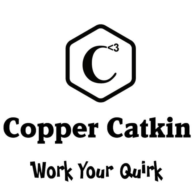
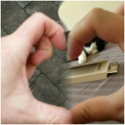
There are 3 ‘C’s in Copper Catkin (even if there’s no third word in the name, there’s my name, Cat – and that’s what we eventually went with). As a man with a mathematical bent, George saw that as C cubed – or C to the power of 3. But he didn’t stop there – he knows that I love using emoticons, so he chose the heart (<3) to go with the ‘3’ . It was a particularly meaningful choice for me because we have a running, cutesy joke about sending each other little hearts, and making cheesy hearts with our fingers, like this:
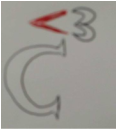
So it was a short step from there to incorporating the heart emoticon in the logo. He scribbled a quick draft, and I loved it.
ts’s actually remarkably hard to design your own stuff, just like it’s hard to sort your own larder, choose your own paint colour scheme, or draw your own tattoo. I think sometimes, you can simply be too close to something, and it becomes both overwhelming, and too important to do yourself. I know that as soon as I have finished something, the first think my critical brain starts doing is picking it apart – so I knew that I needed to get someone else to do the logo design for me. I had great success asking Lisa Park to design my new look for Phersu Dancing Designs, and I will continue to use that brand for my jewellery, so I definitely wanted to use a professional designer for my Copper Catkin branding. This time, I’m really trying to source as much as possible locally, in NZ – and Lisa is in Australia. So, I approached a designer that I knew through a mutual friend, also called Cat, from Byte Design. Unfortunately for me, Cat was flat tack with some major projects, but she steered me to try out the Fiverr services. Given that I didn’t really know what I wanted, either, I decided to take a punt, and it was really useful – for a very small amount of money (a literal fiver – $5US) – you can have someone take your ideas and turn them into a logo!
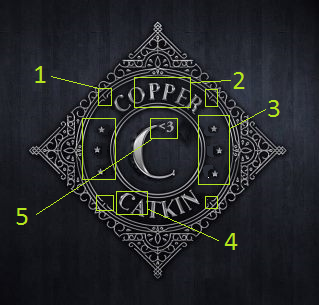
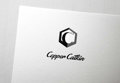
The first person came back to me with figure 1, above. With the help of Cat from Byte Design, I identified what was bugging me about it, and sent it back. My favourite part was her quick mock-up, figure 2, which showed the superscript heart emoticon replacing the ball serif on the ‘C’.
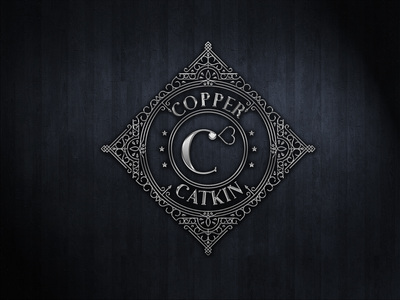
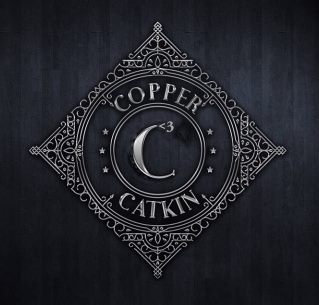
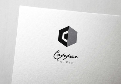
I sent it back for review, as per figure 3, and got these options:
I sent it back for review, as per figure 3, and got these options:
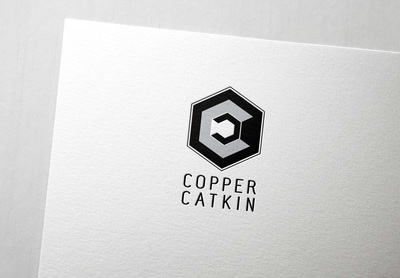
I love them – they’re ornate, pretty, and they *almost* match my requirements. But the very fact that they’re ornate works against them for everyday use. I need something simple, most of the time. So, I tried again. This time, I knew something else – after a wander around the mall, I discovered that Copper Catkin, as a brand, really identifies with hexagons. I don’t know why. it just happened. So, I made this as a mock-up, and sent it to my second Fiverr designer to ‘polish up’.
Once again, it was worth the small outlay to help me further refine what I didn’t want. It was back to the drawing board, but this time, I had a much stronger sense of the logo – and a husband kind enough to help me extract that idea from my brain! We came up with these options.
It turns out that all I actually wanted was a thicker, rounded outline for my simple logo. *sigh*
The tagline
It turns out that the logo was acting like a sort of bottleneck for my creativity in relation to Copper Catkin. Once I had a logo, everything else kind of fell into place. I was thinking that I wanted something with its own, quirky character. Every time I brainstormed, ‘quirk’ came up. Then, it clicked – I’m talking about corporate clothes with a touch of fun, right? And I want my ladies to ‘work it’, right? Feel great, feel different, express who you are without getting fired? Perfect! #workyourquirk was born 🙂
The business cards
Suddenly, with the tagline, it all came tumbling out – and I was ready to design my business cards!
I decided to make one set for inclusion with the Wellington Rabbit Rescue fundraiser items, and another to go with my own pieces. I used designs from my Masala collection, inspired by Indian, South-East Asian, and Pacific recipes.
And now, they have arrived! #winning #workyourquirk
