Posted on Leave a comment

Work Your Quirk on the Cotton Catwalk!

 Are you interested in providing research inputs for Copper Catkin? Would you like to see your shape used to develop garments that will actually fit and flatter you?
If you answered ‘yes’, then please send me through a set of 3 ‘technical’ photos (these are for the garment development) and 5-10 ‘dynamic’ photos (these are to help visualise how the garments and the fabrics might perform ‘in the wild’).

Your original photos will never be displayed publicly, and you will only be credited if you want to be. 

Technical poses

A ‘technical’ pose is relaxed, arms down by your sides, head facing straight ahead. 
A set of technical pose photos is front, back, and profile, wearing close-fitting clothing that changes your shape as little as possible.

Dynamic poses

A ‘dynamic’ pose is more realistic. I’m not talking Charlie’s Angels, here (although that could be funny, too), or very posed pseudo-sexy stretches – I mean something closer to natural movement, but frozen at an interesting point. Think Madonna’s “Vogue” meets dancing under a strobe light.
It would also be really helpful to have your measurements, so that we can start to build up our data:

Requirements 

In order to be able to use your photos, I will need photos of you, in fitted clothes that don’t alter your body shape significantly (except a bra – as these are clothes designed to go over your underwear, please wear what you normally would). Photos should be taken in good light, with your body clearly outlined against a neutral background. 
If you’re keen, please PM through Copper Catkin’s Facebook page:
the 3 technical poses

  • Front
  • Back
  • Profile (side)

5-10 dynamic poses, also suitable for use as silhouettes, for example:

  • one or both arms up
  • one or both arms out
  • hands on hips
  • legs akimbo
  • dance moves
Posted on Leave a comment

Shapes  2 – The Reality Show

Ok, so here’s where it gets real. In order to complete my design brief for the pattern maker, Liz, I had to be absolutely accurate in my drawings of my garments. Liz also requested photos of me in clothes that were similar to what I wanted, with notes, as references. My initial sketches were useful as guides, but the only way I knew how to do it was to draw them on my own shape – so, as well as the reference photos, I had my husband take photos of me in fitted clothing, and then I used them to trace my actual shape. This was a difficult experience, because it’s hard to face yourself at any time, but as a big girl who has lost the weight twice before, and regained it again, it’s even harder, because I was acknowledging my failure to keep the weight off head-on. Still, I persevered, and came up with these.
You’ll notice that the heads look a bit weird – I didn’t take too much time over them, because my focus was on the body shape – but as you’ll see later, the head actually makes quite a difference to the way the clothes look on the body. The guesstimated heads also emphasise my bad posture, and make me look a great deal more glum and slumped than I actually was.
Still, I worked my way through it, using the shape to show realistically where I wanted each garment to sit on my body, so that Liz knew which measurements she would need, and have a diagram to show me exactly where to take them.
Next, I used the garment designs to ‘test’ my fabric designs. This is around about when the head started looking pretty weird, especially in profile.
I decided to add my hair back in, and used unnatural colours, because that’s definitely a quirk I like to work 🙂
The upshot of this was that I suddenly absolutely loved the whole look – and I had so much fun playing with the little ‘me’ figures that I realised, this was a great fabric design opportunity! 
The thing is, these poses were deliberately boring – they were designed for technical drawings of garments. For a fabric, I thought something more dynamic would be good – and then I realised, what I needed was both technical (aka boring) AND dynamic photos of all the shapes! I could then use them to work out good fits for each shape at a design level, using the ‘technical’ poses, and then test the design on the dynamic poses – and then I would use those fun, dynamic poses to make fabric designs! 
So now, I’m looking for some quintessential versions of each of my shapes, in some really dynamic poses. 
Posted on Leave a comment

Competition #1 – Inspiration

Wow, there was a really huge response to our first competition post!
To keep track of it all, let’s sort it into categories – animal, vegetable, mineral.

Animal

Bunnies doing binkies
​Butterflies
Axolotyls
Cats on glass tables
Fighting fish
Crustaceans
Fish
Capybaras
Wombats
Pygmy Hippos
Baby goats
Llamas
Alpacas
​Burros
Dinosaurs for adults
​Dinosaur kamasutra
​Heart-shaped bunny huddle

Vegetable

A skyline silhouette, with a landscape, a series of cacti, etc.
Succulents and cacti
​Fungi
​Roses

Mineral

Fossils

People

Stargate SG-1 characters
Bearded ladies​
Plus-size cosplays
Agatha Christie characters
Kurt Vonnegut characters
​Tom Robbins characters

Food

Sweet Release’s “Dough My Goodness” treats
Butcher’s diagrams 
Burritos

Things

Spoons and skulls
Tea paraphernalia
Minigolf courses
Subversive Girl Guide/Brownie badges
Sporks
Siberian princess tattoos
Posted on Leave a comment

Shapes

So, I mentioned in a previous post that I was trying to come up with a good system to help women identify if an outfit would fit them or not.

I figured out that the closest thing to my own shape was the New Zealand sweet potato, called a kūmara.

I started doodling shapes, to see if I could figure out the different plus-size body types. As you can tell from my drawings, the ones closest to my shape were the easiest for me to draw.
I posted on my Facebook wall, inviting comment, and was pleased to find that I had correctly identified enough of the right shapes that my friends could find themselves in the drawing. 
Picture

Beautiful Butternut

Picture

Pretty Parsnip

Picture

Curvy Kumara

Picture

Ravishing Radish

Picture

Saucy Shallot

I decided to test the shapes on the range of possible designs that I had come up with for my own, kumara shape on these shapes, to see what happened – and it was fascinating.  
First, the dress – as it seems to fit almost every shape, this one is a dead cert. Pretty parsnips with smaller busts may not like them as much, but given that it’s a stretch bodice, at least they won’t sag the way a structured/tailored bodice will. As expected, the hourglass wears it the best, but the kumara (highlighted) doesn’t look too terrible, either 🙂
Another fairly universal winner is the blouse, although its success with each shape will be more a case of personal taste. A lot of women will also feel better if it’s belted, which leads me to the next one – the cincher.
The shape is still very much a draft, but the effect is very specific – and as you can see, it only really suits the bustier shapes. I think it will be worth spending a lot of time on developing the cincher design, because if it’s good, it will be very, very good, but if it’s not – ugh.
The skirt is another very subjective design. Again, it looks best on the curvier figures, although the radish still has enough va-va-voum to carry it off – poor parsnip. We will have to devote some serious attention to her, down the track.
Conclusion – these designs will definitely work for the kumara:
They probably won’t work for all the shapes, though – so I am going to take a punt and rate them as I expect they will play out:
Dress: Shallot, Butternut, Kumara, Radish.
Blouse: Shallot, Butternut, Kumara.
Cincher: Shallot, Butternut, Kumara, Radish.
​Skirt: Shallot, Butternut, Kumara.
Posted on Leave a comment

Clothes for a curvy kumara

There’s something comforting about having your ducks in a row. I know what shape I am:
I know what sort of garments I want to make for my shape, and which ones I want to start out focussing on. 
And I even know how to get them! I’m working with a pattern-maker now to get my designs turned into reality. In the meantime, because I have the clothing shapes and the fabric designs, old and new, well underway, I can start thinking about how I will combine them into successful outfits.
Using the magic of MS Paint, I have figured out how to use my garment sketches as stencils – I overlay them on my fabric design patterns to see how they would work out as dresses. Here’s an example of the process:
And here are some mock-ups of the outfits that I plan to make for my test-drives. Which ones should I choose???
Posted on Leave a comment

Fabric design collections – Legacy

I have been designing fabrics casually for years, under the banner of Phersu Dancing. These are some of my old collections, that will be rebooted and updated for sale if people are interested.

Poppies

My poppy designs were some of my most popular sellers ever. I made them into designs for my packaging, and also as a fabric design, aimed for tablecloths for my market displays, and dresses. 

Jellybean Butterfly

My Jellybean Butterfly collection is an oldie but a goodie – it came out of a design for something bright and colourful to go on the bottom of the custom longboard that my husband was building for me. Sadly, I had an old injury that flared up, and as a result, I couldn’t learn to longboard, so the physical deck never eventuated. The design was so charming, though, that I decided to make it into jewellery, and I had a small length of the fabric printed. 

I have plans to fill out the collection with simple, complimentary patterns – jellybeans, coffee beans, butterflies, and stripes. 

Stained-Glass Butterfly

The butterflies that I used for the Art Nouveau stained-glass butterfly collections were the ones that I drew for the Jellybean Butterfly fabric. 
I coloured them differently, and then used them in a variety of new designs for my ‘Steampunk Butterfly’ collection, using the cog designs that my husband and I created for our wedding stationery. The little twist with these was that the stripe is created from the word ‘Steampunk’ in barcode font.
I have refreshed these designs, and added some more, below. 
Posted on Leave a comment

Plus-size problems

A while ago, I started thinking about what I really wanted to wear. Pretty quickly, words like ‘eclectic’, ‘fun’, and ‘quirky’ started flying around. But you can’t really get fun plus size clothes, can you? Well, you can – but they often end up looking like a costume unless you really own the look. One example is the amazing Rockabilly fashions that have been appearing over the last few years – amazing, fun, and flattering for us curvier shapes – but they’re from a time when women regularly spent a lot more time on their appearance, and they require a great deal of commitment. 
That’s not really practical for everyday clothing.
Then, I started thinking about how I would make a corporate steampunk line – I designed my wedding outfits, and learnt a lot about plus size fashions in the process – for example, we need MUCH longer tops than you would expect, even under a corset! Corporate steampunk would require some really structured lines, and a lot of fabric in each garment. Again, this type of clothing wasn’t terribly practical for grab-and-go workday wear, and the couture aspect required a higher level of design experience than I currently have in my portfolio – so that idea got shelved, too.
So what did I mean by ‘fun’ workwear?
I sat down and did some Googling, and I established that what I really meant was something that let me buy my basics like black pants, simple leggings, cheap tops, and dress them up with accessories that made them into something more – I wanted adorable but comfy shoes; clever, flattering belts; light little jackets that gave me a shape; and the occasional piece of feature clothing that I could mix and match with my basics. That could be a cute dress that I could wear with a long-sleeved shirt and leggings in winter; a blouse to dress up my boring black pants; a little stretchy skirt to make me feel happier about wearing tunics or shorts with leggings; and most importantly, and elusively, something to pull in the sack-like plus-size tops in a way that would flatter me and give me a shape, without being too uncomfortable to wear at my desk all day. 
So, where is this heading, I hear you ask?

What is my shape?

In classic body shapes (apple, pear, etc.), I think I’m somewhere between hourglass and rectangle. This sounds impossible, but that’s the thing with plus sizes – once you start putting more weight on someone’s frame, they carry it differently. So, how do I express that? 
I looked at the different plus-size websites, and they were all too diplomatic to be really clear. 
Here’s an example from the Lane Bryant website, which has three collections of pants – the ‘Lena’, the ‘Ashley’, and the ‘Sophie’. This is from the ‘Sophie’:

FOR SHAPES THAT ARE FULLER IN THE WAIST AND STRAIGHTER THROUGH THE HIP AND THIGH.

But what does that even mean? I couldn’t get any of the words to match my shape, and the models all seemed to be used interchangeably. There were no clear guidelines, measurements, or graphics to help me choose, and none of the models had bellies, so I couldn’t get any guidance from there. I decided that I would start with identifying a new shape for myself, and then going from there to figure out what clothing might flatter my own shape. Then, I could use that as a benchmark to try to identify more shapes and the cuts of clothing that would work for them.

What do I like to wear?

So, if I was going to start with my own shape, I needed to figure out what parts of it mattered, in terms of flattering cuts and comfort, so I started by thinking about what things I like to wear, and what things I don’t.
I like simple clothes. I like layers, but only hen it’s really cold. I get warm too easily, otherwise. I don’t like tops made of such thin fabric that you have to wear another layer underneath. I like jeans, and belted blouses and tunics. I like Ponte di Roma pants, and leggings, and things with stretch that doesn’t confine.
I like fit-and-flare dresses, because they flatter me, but I don’t like wearing them, because the skirts, by their very nature, flare – they’re annoying in the car, they’re uncontrollable in the Wellington wind, and they make everything just a little bit more unmanageable. On top of that, they make me look and feel ‘dressed up’ – so, while I love the way dresses look, I would need to practise wearing them to get comfortable. Then, there’s the fact that they show my legs – so I would need to wear leggings or tights, and the right kind of shoes, and yikes, this is hard.

What *would* I like to wear?

The thing that I find myself searching for the most often is something to work like a comfortable corset – give me shape, but be more structured than a belt, without cutting off circulation or preventing me from taking a deep breath. This seems like a really simple thing, but it’s turned out to be the most complex of all – how exactly to design something I pull over my head, that still looks as structured as a waistcoat, as simple as a belt, and as flattering as a corset, whilst being as comfortable as a vest?
So, I started scribbling…
Pretty soon, I had narrowed it down to a few garments that I thought would work well – high-waisted, fold-over pants; a tunic that can be worn with or without a belt; a fit-and-flare dress, but without too much fabric in the skirt, and a stretchy bodice; and a flounce-sleeved, pussy-bow blouse.
Based on these sketches, I started drawing some ideas for fabric designs, which became the Masala Collection. Now, I knew what I wanted to have made to fit me, and what kind of look those clothes might have. I was underway!
Posted on 1 Comment

Fabric design collections – Masala

This collection came about as I started doodling ideas for some fun and quirky fabric. I decided to inspire myself with recipes. I started by looking up curries, spice mixes (hence the name, ‘masala’), and chutneys, then moved on to look for ingredients in South-East Asian and Polynesian cooking.
I initially thought I was going to have several different designs, but the ingredients looked really good when they were all combined into one image.
From this original concept, I extrapolated a stripe, using the previous technique of a word in barcode font, and a polka-dot based on sliced rhizomes (ginger, turmeric, etc.)
Posted on Leave a comment

Rabbit Rescue Update

Well then, it’s only been a wee while since my last post, but so much has happened!
To help with my sanity, I will focus this post on the WRR fundraiser, and the next one on Copper Catkin itself.
So the first big news is that I have finished all three panels for the WRR fundraiser!
There will be three designs available – ‘Beyond the Kale’, Weasels in the Warren’, and ‘Carrot Cartel’. 
Over the last month, I have been running a survey to get an idea of what people would buy, and how much they would be likely to pay.
I’ve also been organising our Kickstarter team, so that we can get the video clip made, and get things underway. I’m very lucky to have some amazing friends on board, and I will update you about the Kickstarter once we have it up and running.
From the survey results, we know that people are interested in the products we plan to offer, which is really exciting – and it confirms that my instincts for product and pricepoint were also bang on the money, which is really comforting.
It looks like initially, we’re going to be offering tea towels, tote bags, postcards, limited edition signed colour prints, and if we make our initial goals, t-shirts and mugs, too – so if you’re interested, follow Copper Catkin on Facebook for updates!
Posted on Leave a comment

‘Stationery’ and moving

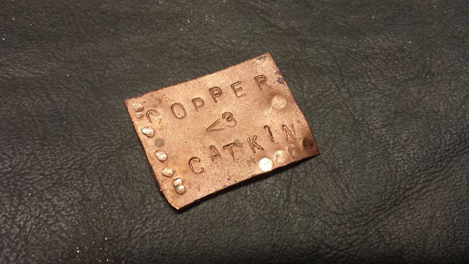
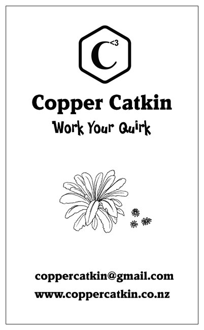
That’s right, we’ve got a logo, a nifty little tagline, and now, business cards! As the Geordie Shore lot like to say, GET IN!

The saga of the logo

The logo has been a bit of an adventure, actually.
I came up with the ‘Copper Catkin’ part of the name some time ago – the contradiction appealed to me – the fluffy catkin, made of shiny metal. I chose copper as a nod to my interest in all things Steampunk, and I have loved catkins since I was a wee kitling myself.  The combination plant and metal is also a quiet nod to NZ’s silver fern.
As I played with the name, I knew I was at risk of choosing another name that didn’t reflect my brand, which was something people commented about with Phersu Dancing.
I tried adding in a third word – ‘Copper Catkin Clothing’? ‘Copper Catkin Creations’? ‘Copper Catkin Compulsion’? ‘Clothing by Copper Catkin’?  I just couldn’t get the name to gel correctly.
As I always do these days, I talked it out with my husband – and he came back with a really clever suggestion.
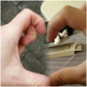
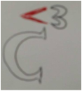
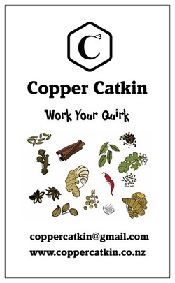
There are 3 ‘C’s in Copper Catkin (even if there’s no third word in the name, there’s my name, Cat – and that’s what we eventually went with). As a man with a mathematical bent, George saw that as C cubed – or C to the power of 3. But he didn’t stop there – he knows that I love using emoticons, so he chose the heart (<3) to go with the ‘3’ . It was a particularly meaningful choice for me because we have a running, cutesy joke about sending each other little hearts, and making cheesy hearts with our fingers, like this:
So it was a short step from there to incorporating the heart emoticon in the logo. He scribbled a quick draft, and I loved it.
ts’s actually remarkably hard to design your own stuff, just like it’s hard to sort your own larder, choose your own paint colour scheme, or draw your own tattoo. I think sometimes, you can simply be too close to something, and it becomes both overwhelming, and too important to do yourself. I know that as soon as I have finished something, the first think my critical brain starts doing is picking it apart – so I knew that I needed to get someone else to do the logo design for me. I had great success asking Lisa Park to design my new look for Phersu Dancing Designs, and I will continue to use that brand for my jewellery, so I definitely wanted to use a professional designer for my Copper Catkin branding. This time, I’m really trying to source as much as possible locally, in NZ – and Lisa is in Australia. So, I approached a designer that I knew through a mutual friend, also called Cat, from Byte Design. Unfortunately for me, Cat was flat tack with some major projects, but she steered me to try out the Fiverr services. Given that I didn’t really know what I wanted, either, I decided to take a punt, and it was really useful – for a very small amount of money (a literal fiver – $5US) – you can have someone take your ideas and turn them into a logo!
The first person came back to me with figure 1, above. With the help of Cat from Byte Design, I identified what was bugging me about it, and sent it back. My favourite part was her quick mock-up, figure 2, which showed the superscript heart emoticon replacing the ball serif on the ‘C’. 
I sent it back for review, as per figure 3, and got these options:
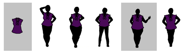
I love them – they’re ornate, pretty, and they *almost* match my requirements. But the very fact that they’re ornate works against them for everyday use. I need something simple, most of the time. So, I tried again. This time, I knew something else – after a wander around the mall, I discovered that Copper Catkin, as a brand, really identifies with hexagons. I don’t know why. it just happened. So, I made this as a mock-up, and sent it to my second Fiverr designer to ‘polish up’.
Once again, it was worth the small outlay to help me further refine what I didn’t want. It was back to the drawing board, but this time, I had a much stronger sense of the logo – and a husband kind enough to help me extract that idea from my brain! We came up with these options.
It turns out that all I actually wanted was a thicker, rounded outline for my simple logo. *sigh*

The tagline

It turns out that the logo was acting like a sort of bottleneck for my creativity in relation to Copper Catkin. Once I had a logo, everything else kind of fell into place. I was thinking that I wanted something with its own, quirky character. Every time I brainstormed, ‘quirk’ came up. Then, it clicked – I’m talking about corporate clothes with a touch of fun, right? And I want my ladies to ‘work it’, right? Feel great, feel different, express who you are without getting fired? Perfect! #workyourquirk was born 🙂
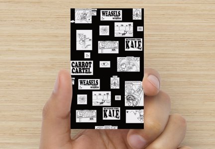
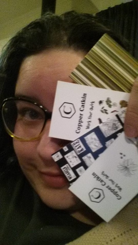
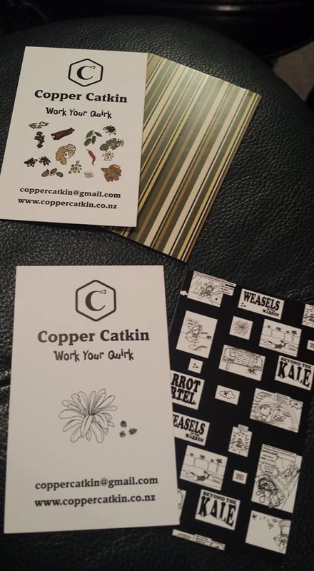
The business cards

Suddenly, with the tagline, it all came tumbling out – and I was ready to design my business cards!
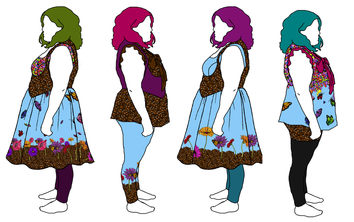
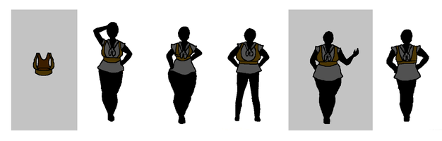
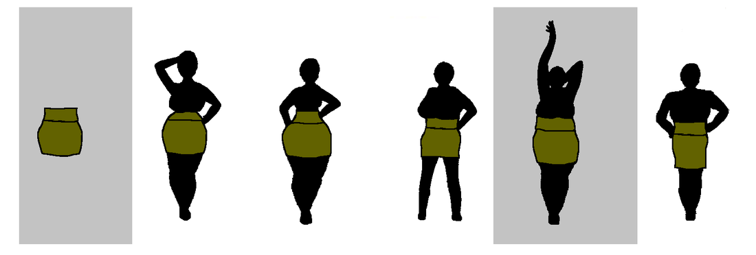
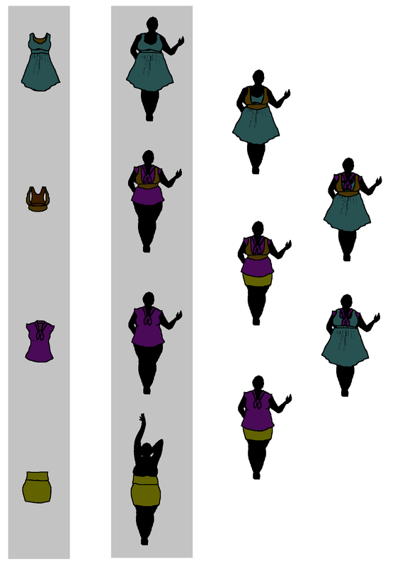
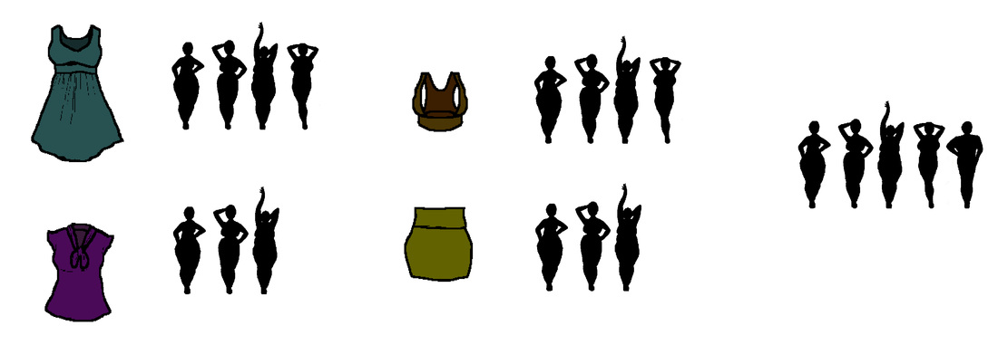
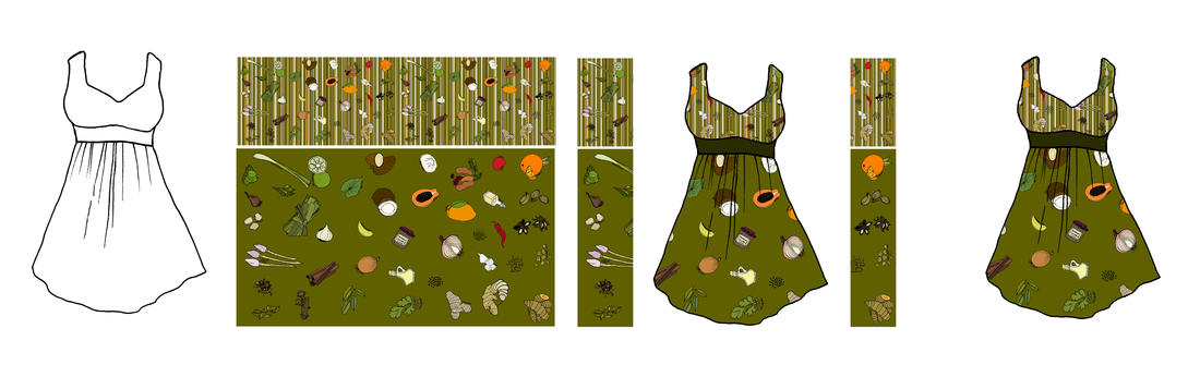
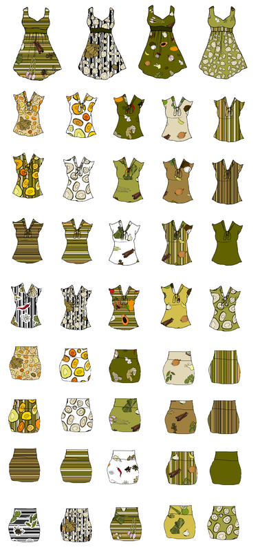
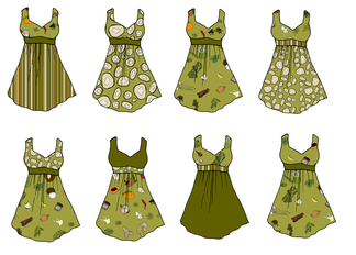
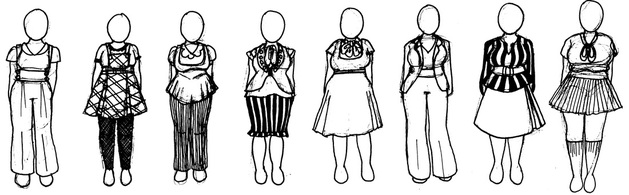
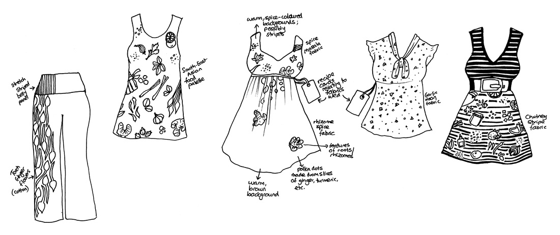
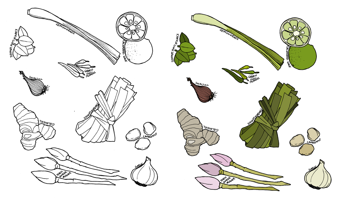
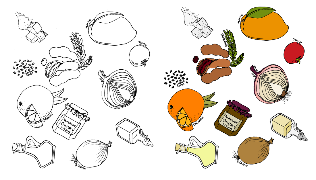
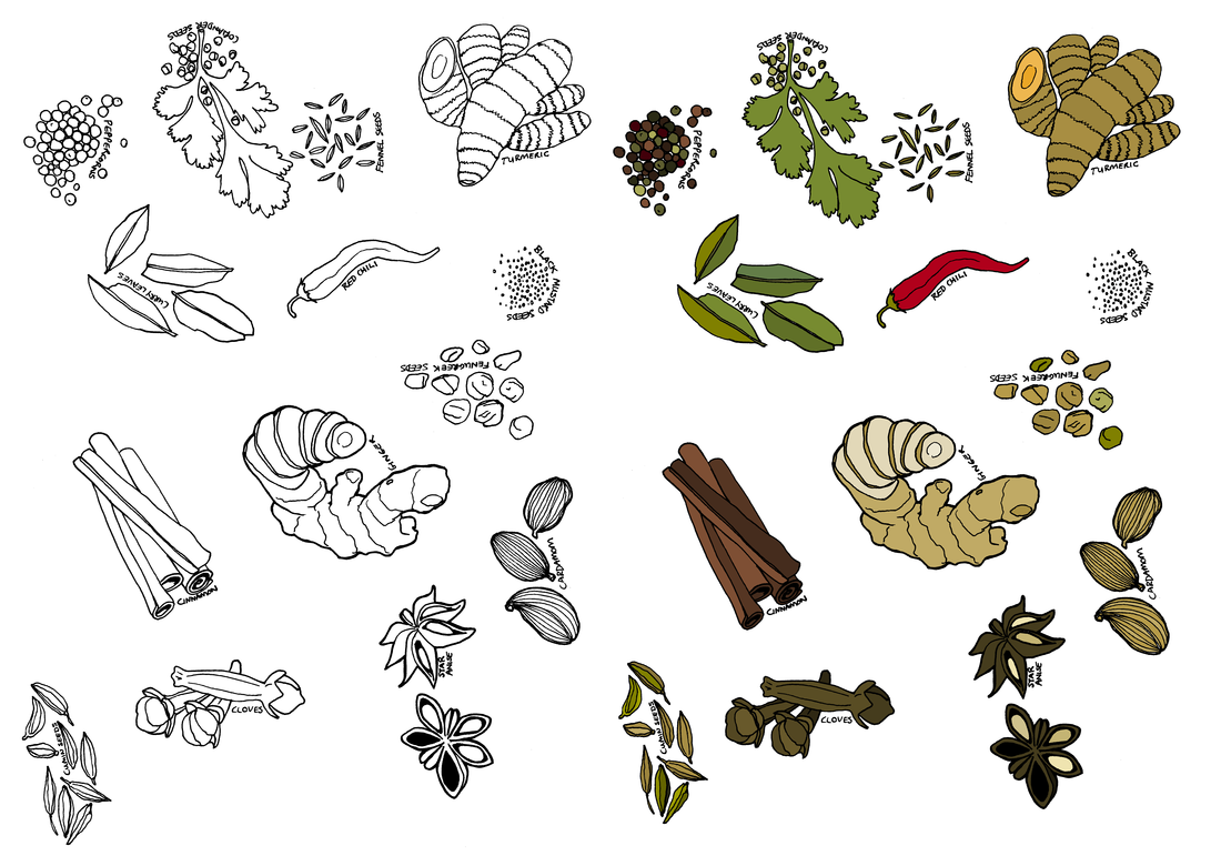
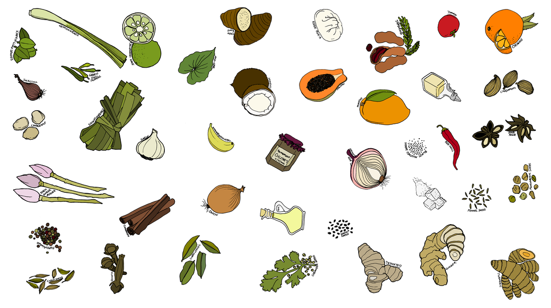
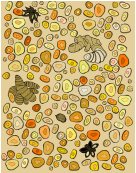
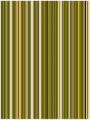
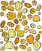
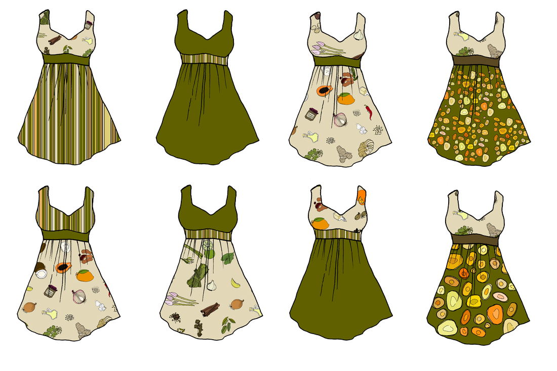
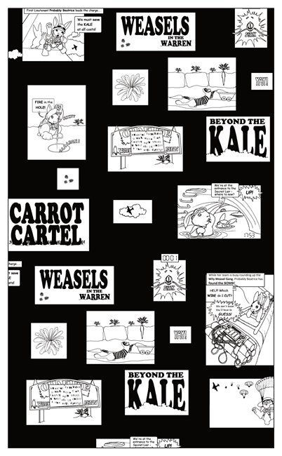
I decided to make one set for inclusion with the Wellington Rabbit Rescue fundraiser items, and another to go with my own pieces. I used designs from my Masala collection, inspired by Indian, South-East Asian, and Pacific recipes. 
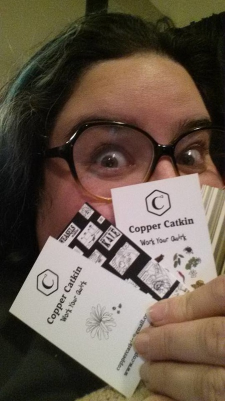
And now, they have arrived! #winning #workyourquirk