Posted on Leave a comment

My love affair with Ligne Claire

I love MS Paint. There, I said it.

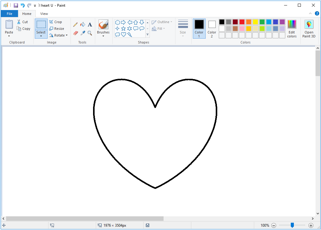
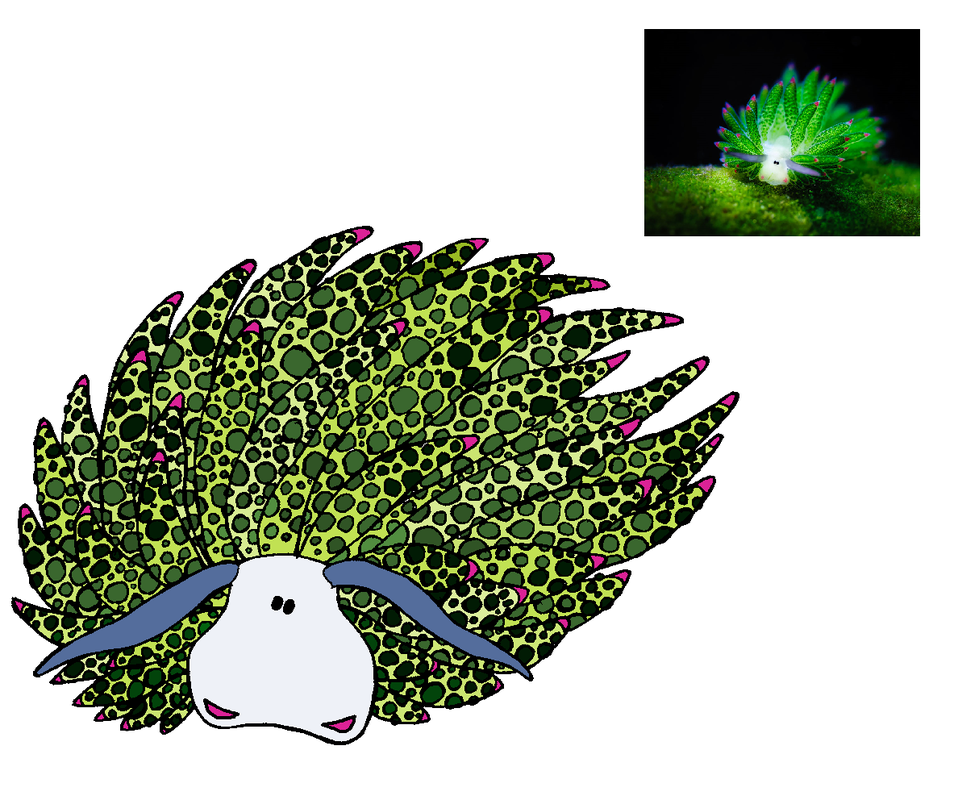
​I spend a lot of time and energy defending my preference for MS Paint to edit and colour my images. I know, I know – I could get much greater depth of colour and realism with other applications that are designed to reduce the labour and simplify the process. But the thing is, the process is part of the pleasure – and I am already a really fast worker. The MS Paint stage of my drawing is my form of meditation – I can’t distract myself enough any other way than by focusing on those pesky pixels.

This guy gets it!

​I suppose part of my liking for Paint is the way I get the nice, flat colours, reminiscent of gouache. And the reason that those effects appeal to me lies in my upbringing.

Bandes dessinées

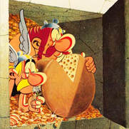
I grew up in Switzerland, New Zealand, and Belgium. As a result, I speak fluent French – and I have a passion for BDs (Bandes dessinées, or ‘drawn strips’). They’re not quite the same as ‘comics’ – which by their very name imply a humourous subject matter – and they have been treated as a much more serious art form. Many of the stories contained more layers than their translations, too, so it’s very hard to explain the cleverness of, for example, Astérix, to someone who has only read it in the dumbed-down English translation.

Ligne Claire

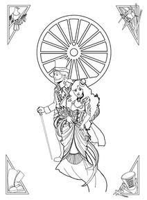
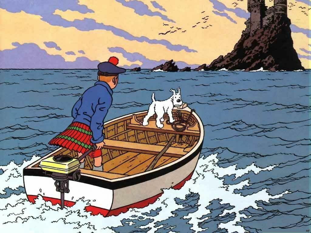
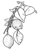
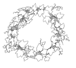
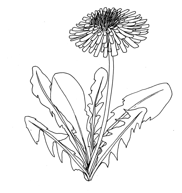
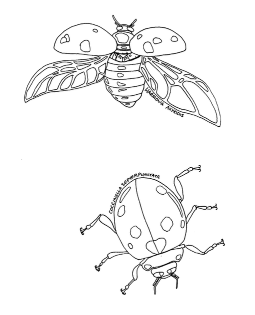
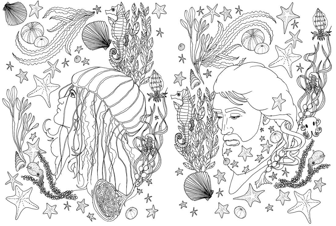
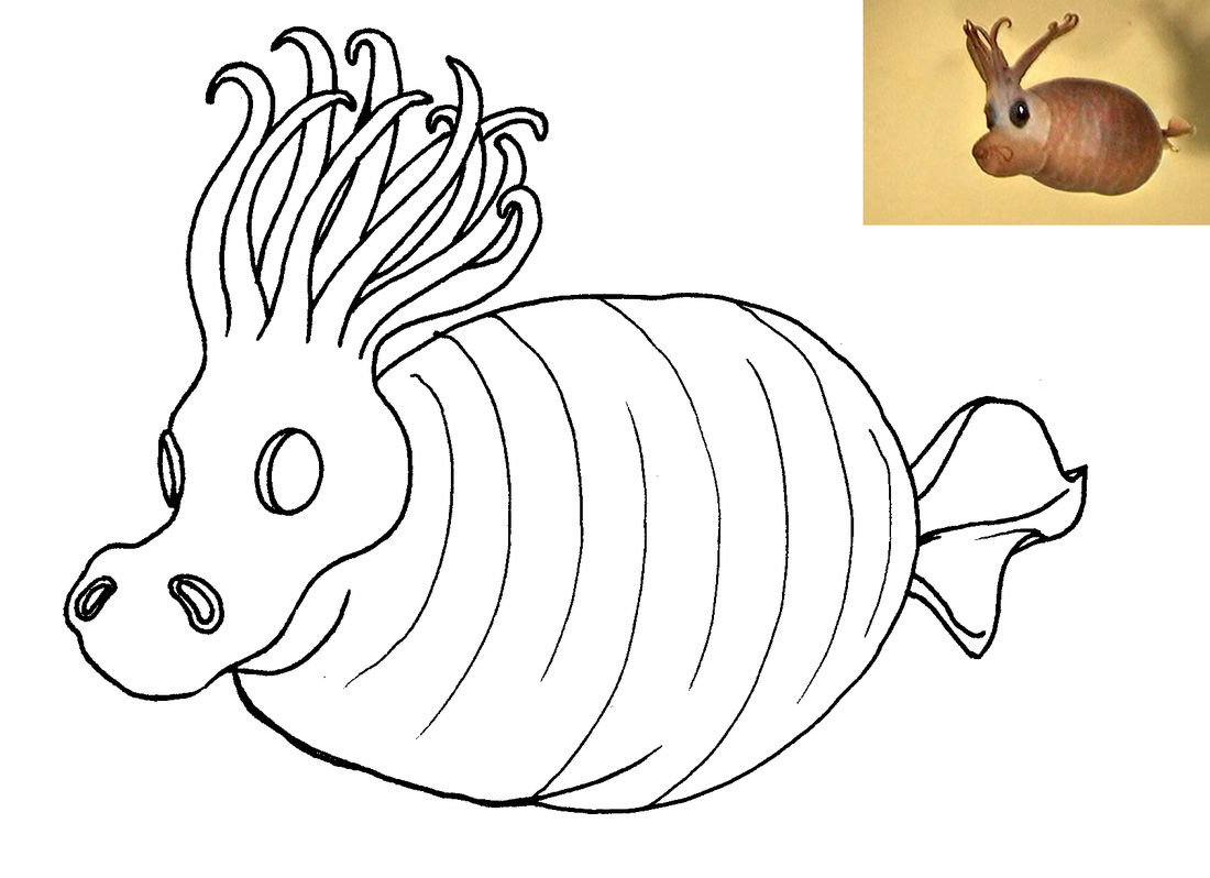
As expected, my style was strongly influenced by the BDs that surrounded me as I grew up, particularly Hergé and his ligne claire or ‘clear line’ drawing style. My standard drawing technique is to sketch in pencil then finalise and refine the design in pen, which is a very common sketch artist’s technique. I then use flat colour to give my images life. I rarely use shading of any sort, and I strongly object to cross-hatching.

Alphonse Mucha and Art Nouveau

Picture

One of my draft wedding invitation ideas

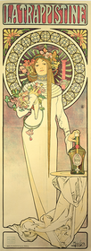
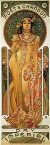
Another great influence on my style is the advertising artwork of Mucha. His strong, clear linework, and effective use of colour lends itself really well to stained glass – and the bold lines and organic shapes appealed to my ‘ligne claire’-influenced brain. Art Nouveau’s simple, beautiful complexity has meant that the style is still very much current today – people are still working in their own versions of the Art Nouveau style, and its enduring popularity suggests they are likely to continue to do so. 

Functional Graphics

Picture

An artwork that I did for the Felt Aid fundraiser after the first Christchurch Earthquake

I have trouble categorising myself as an ‘artist’, because what I create isn’t truly art for its own sake. I draw because the drawing will be useful – just as Alphonse Mucha drew to make posters, and BD illustrators draw to support a storyline, I draw because my images will become something more than lines on a page. They will be made into fabric designs, and printed to be sewn into all manner of useful and decorative things; they will be made into jewellery, to gladden hearts and add quirks to any outfit; they can be printed onto clothing and accessories to make a statement or bring a smile to a stranger’s face. I draw for practical reasons, and my drawings are always intended to be used. I suppose, rather than ‘art’, I would call what I do ‘functional graphics’.

So, what is my process?

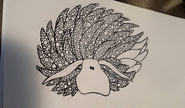
I start with a piece of blank A4 and a pencil, and I scribble the basic outline. If I like it, I go over it in detail with the pencil, then again with my black marker. I rub out the pencil lines, then scan the image in crisp black and white. 
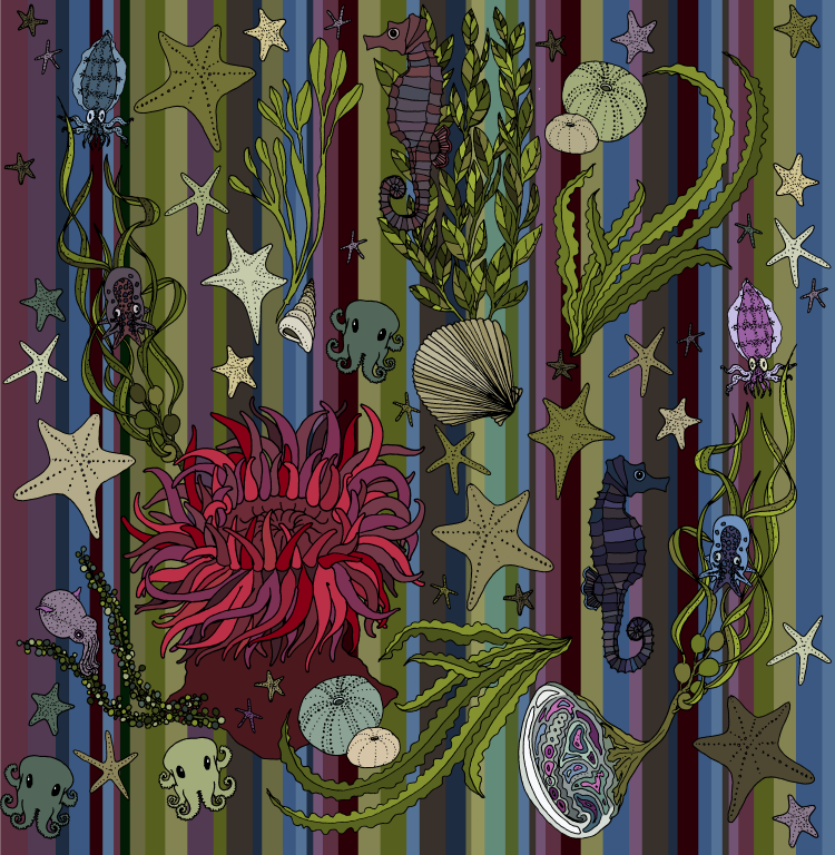
Once the image is scanned, I take it down to monochrome bitmap, to be sure to clean out any residual mess, and then save it as a full-colour bmp file, and start colouring. Once I have the individual elements of a design finished and coloured, I combine them into a single layout. I manually create and test the repeat until I am happy with it, then paste it over a variety of backgrounds, to create additional designs in the series. These designs are then uploaded to Spoonflower and printed as fabrics. I also make variations on each design to be printed as clothing and accessories on Redbubble (depending on the design, this can required up to 5 different versions of the same illustration per design page), and to print and use for jewellery.

Once the designs are finished, I release them into the world, and they hopefully give others the pleasure that they have given me to create. You can pop over to my design collection homepage to see which of my designs are available to brighten up your home.
Posted on Leave a comment

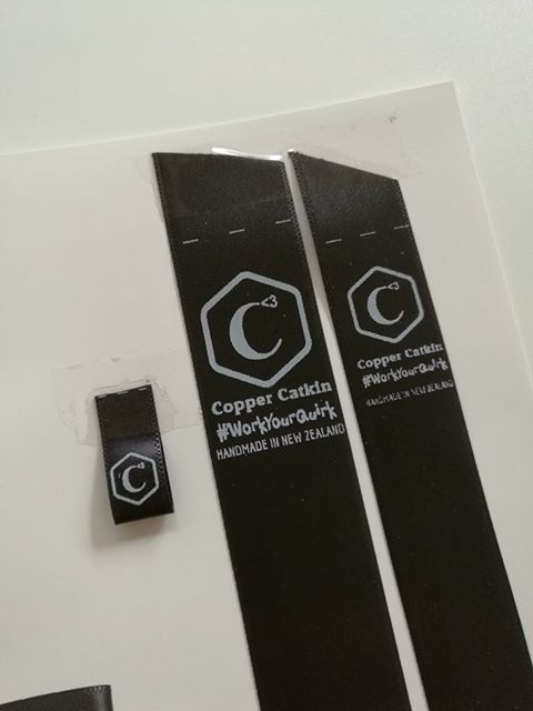
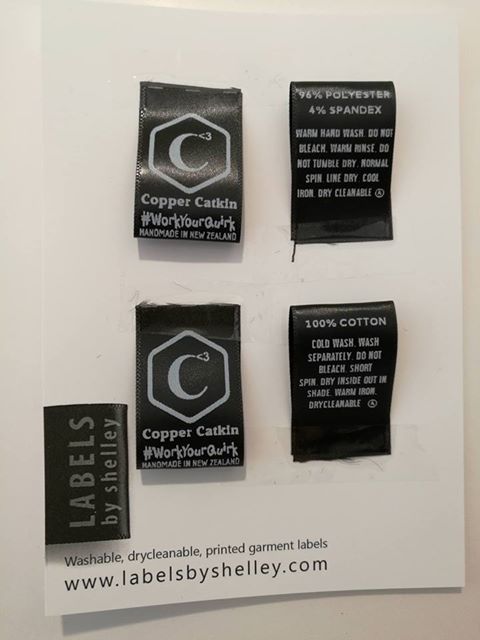
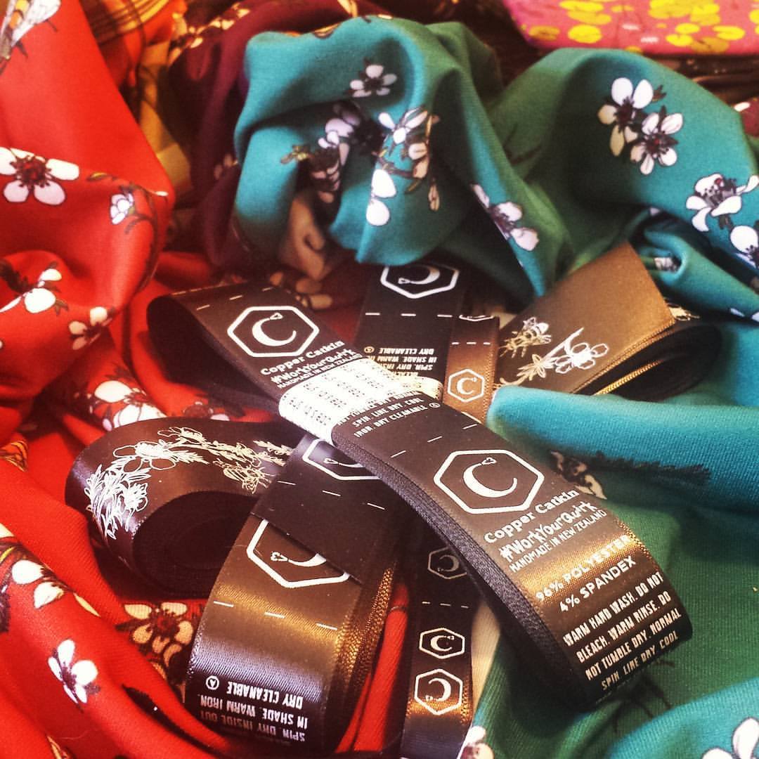
Copper Catkin has labels!

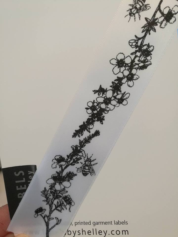
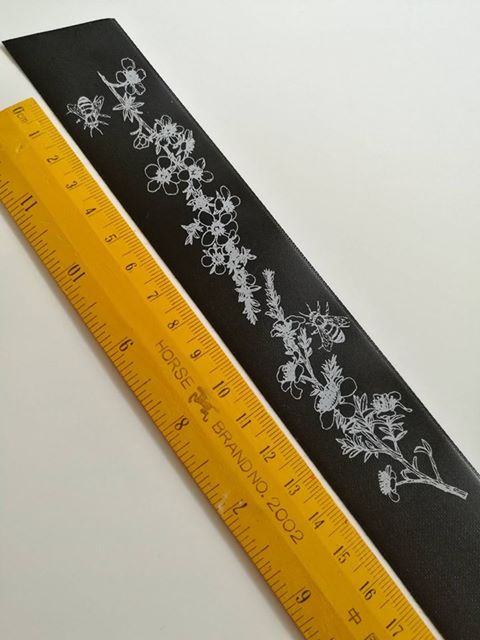
With the move towards making more fabric items, we also need some fancy branding – and care labels! Luckily, Labels by Shelley was there to help!
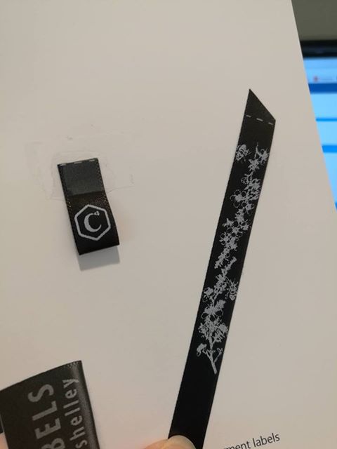
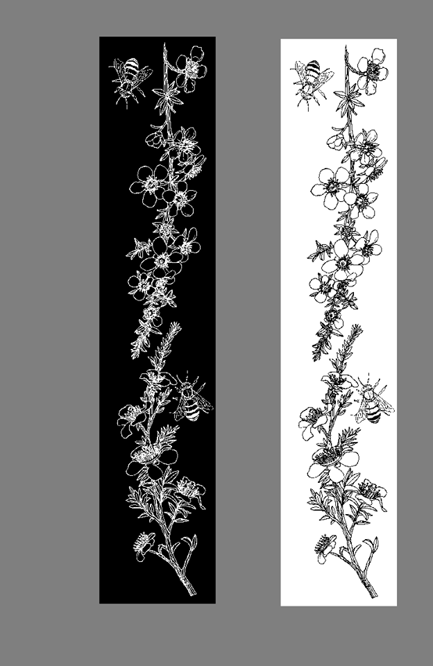
Not only did Shelley work with me to make sure I was happy with the end result, but she also helped me to custom-print some ribbon with my Manuka print on it! I’m looking forward to finding just the right project for it!
And now it’s time to start attaching them to new fabric products!
Posted on Leave a comment

New Infinity Scarves

What’s an infinity scarf?

Put simply, it’s a continuous, or ‘infinite’, loop of fabric, designed to be looped around your neck twice. 
What are Copper Catkin scarves made of?

We currently offer jersey and chiffon scarves. 
What designs are available?

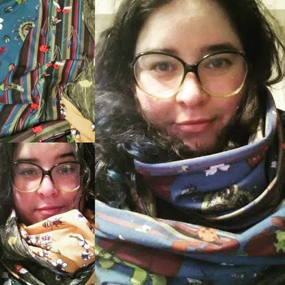
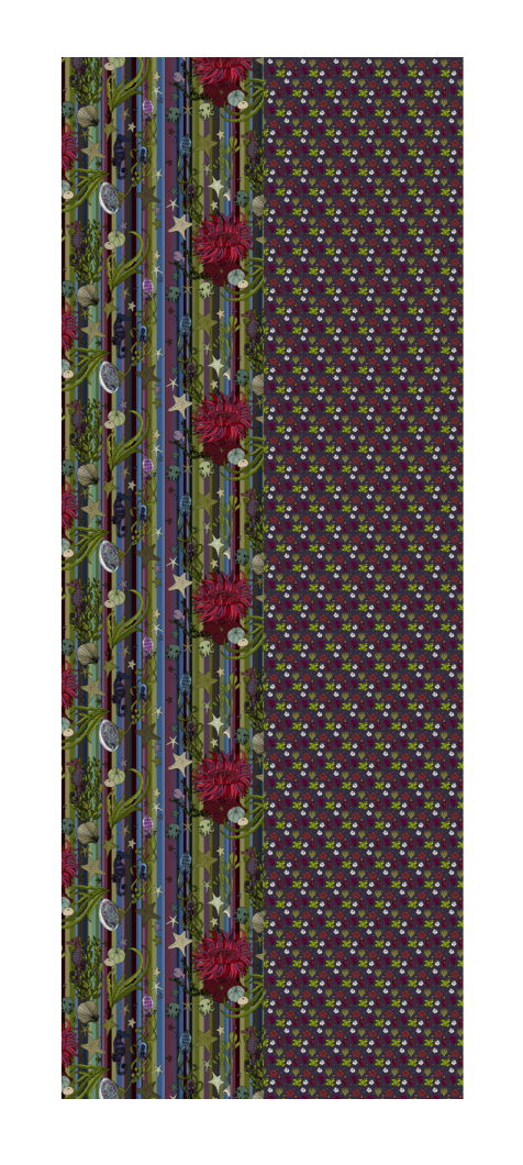
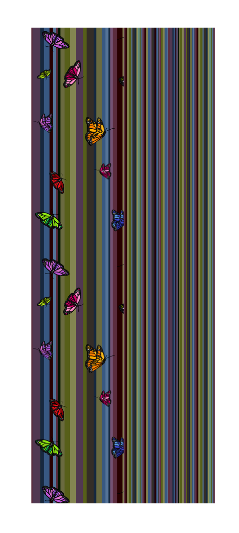
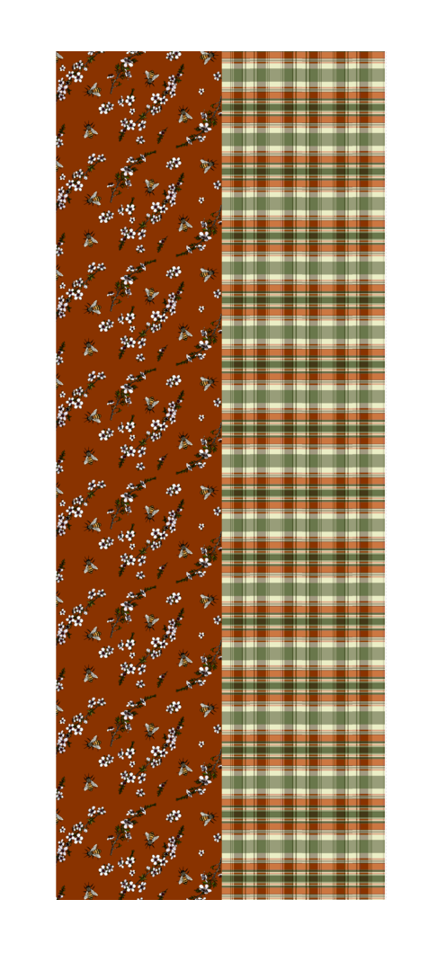
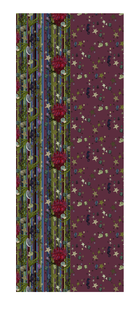
Every scarf features a quirky combination of two custom-printed Copper Catkin designs, carefully chosen to work together without being too matchy-matchy. Here are some examples:

Why are Copper Catkin infinity scarves so expensive?

The fabrics are custom-printed via Spoonflower in the USA, so they’re expensive to bring into the country, plus there is the cost of making them.

If you prefer, you can choose to buy the infinity scarf fill-a-yard project directly from Spoonflower and make your own combinations. They offer a selection of fabrics! You will then receive two yards of fabric with two scarf designs, ready to sew.

Posted on Leave a comment

New Bow Bags

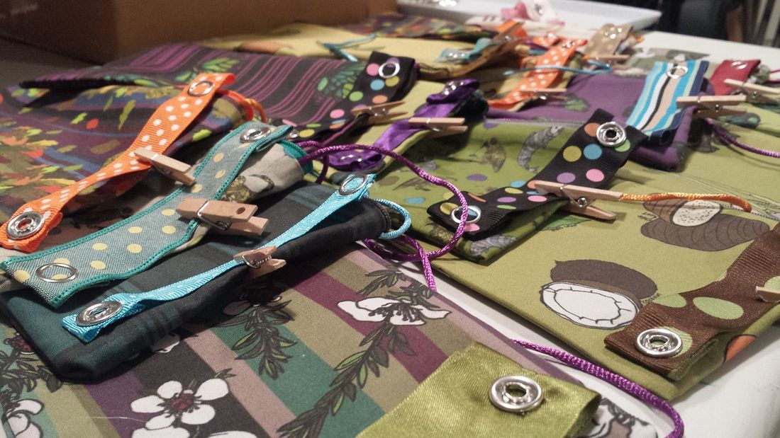
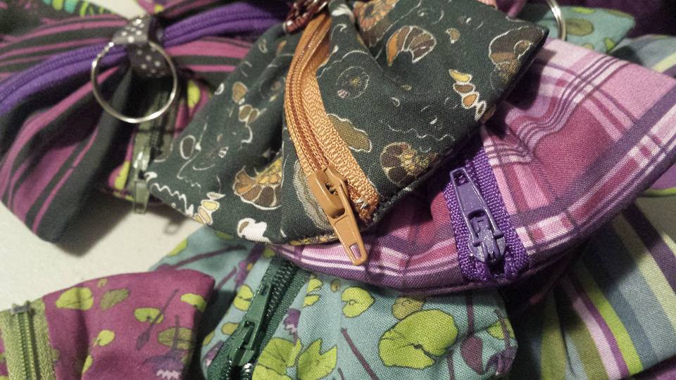
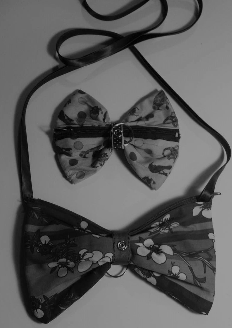
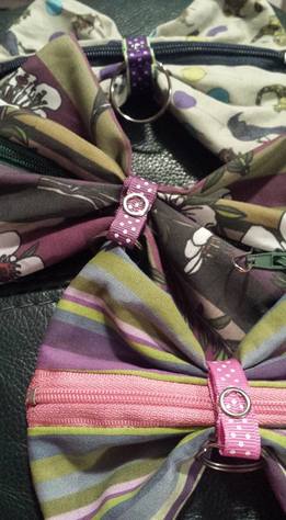
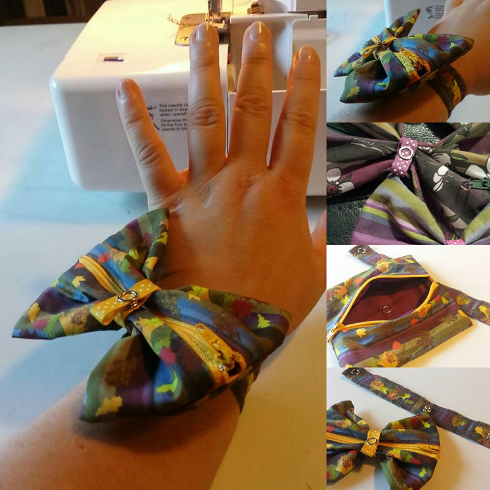
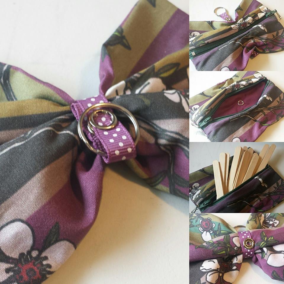
A few months ago, I started making small bags and other items to show what can be done with a single fat quarter. In the process, I developed this simple little design – it fastens in the middle into an adorable little bow, and opens out into a trinket bag.
I developed the design into a larger bow purse, and arranged it so that the smaller bags can even clip onto the larger ones.
The bags can also clip onto a wrist band, which is cute. I’m experimenting with other ideas for using the bags as cute, practical ornaments.
Posted on Leave a comment

Rockpool Fabric Design

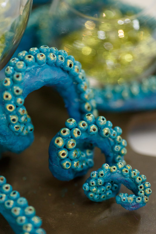
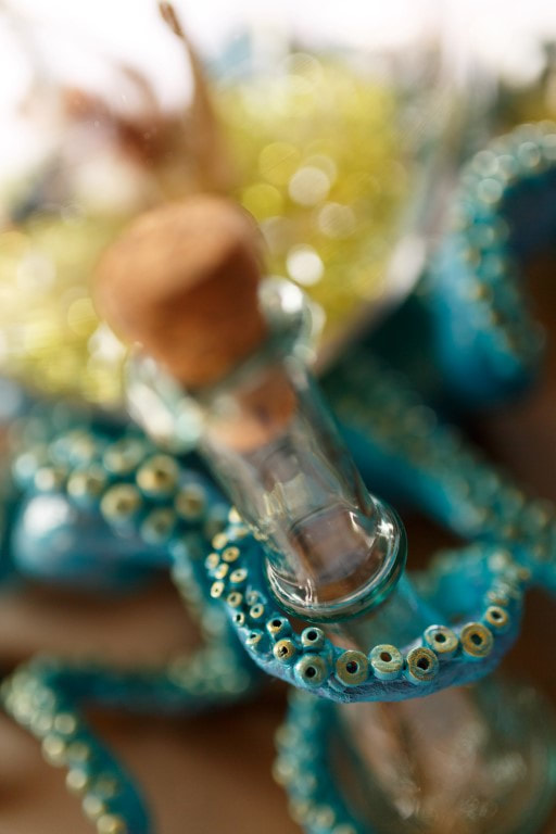
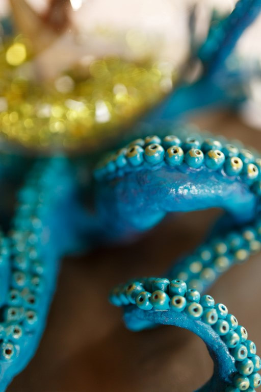
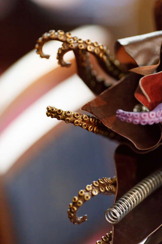
​I’ve always been a big fan of tentacular creatures – so much so that we used them as inspiration for our wedding table centrepiece.
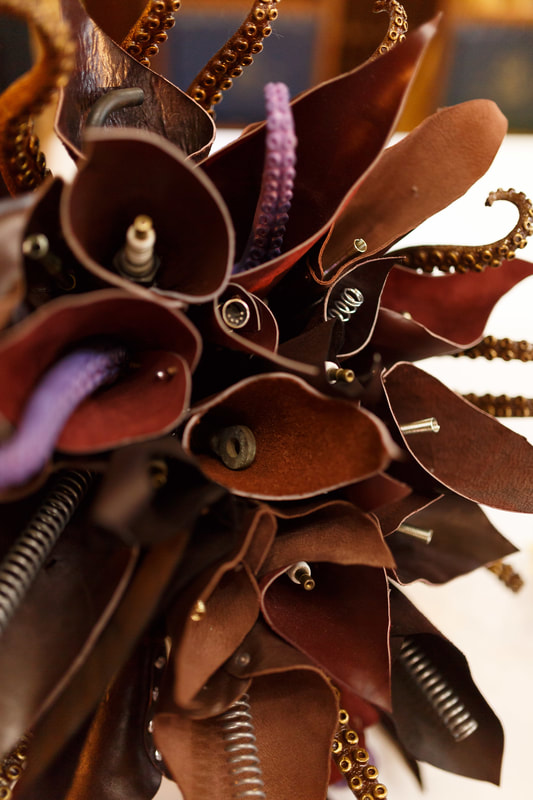
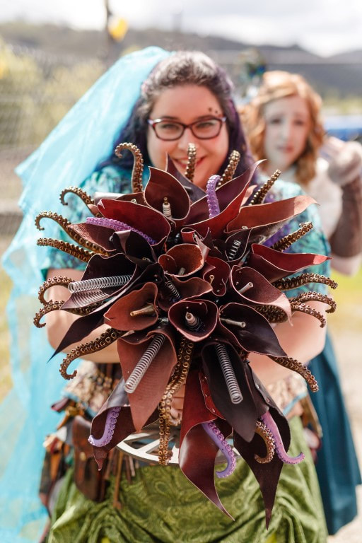
I also used tentacles to add quirky, steampunky interest to my bouquet.
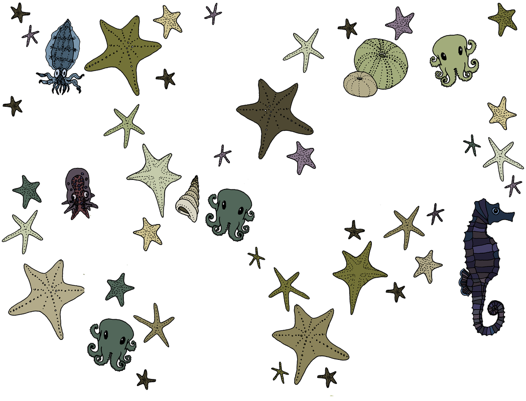
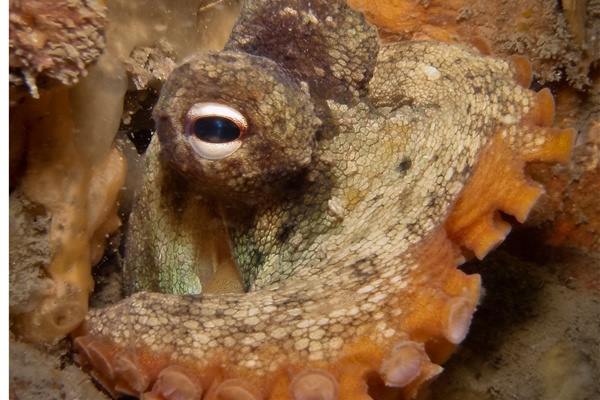
As with many of my designs, some of the inspiration for this design is the impending birth of a child. One of my (pregnant) friends has always been a big fan of cephalopods, so as research (and entertainment), I began following the regular posts of Octomum, a recently-delivered mother of many at the Island Bay Marine Education Centre.
I used their amazing photographs as inspiration for the range, and gradually, a design came together. 
These pieces will be part of my upcoming colouring books. I continued to use the same images to come up with a couple of fabric designs, too.
The new fabrics have just arrived – we’re pressing, cutting, and folding them this week, and look forward to having them for sale as fat quarters, infinity scarves, and fabric crafts in the near future.
Posted on Leave a comment

Meadow

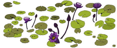
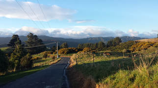
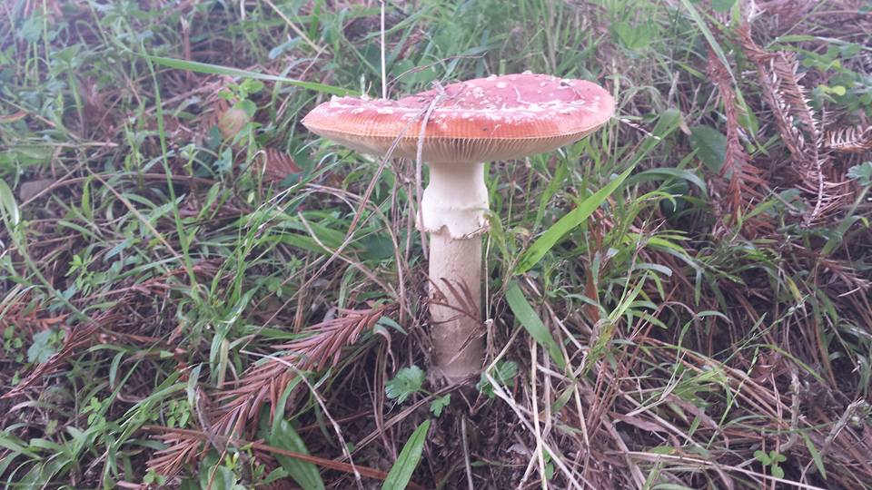
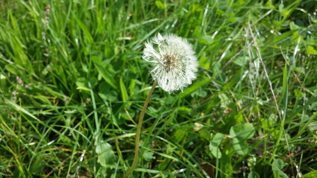
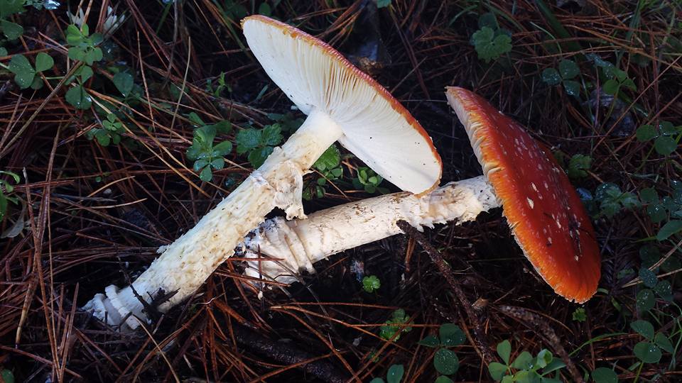
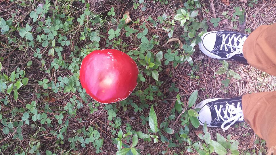
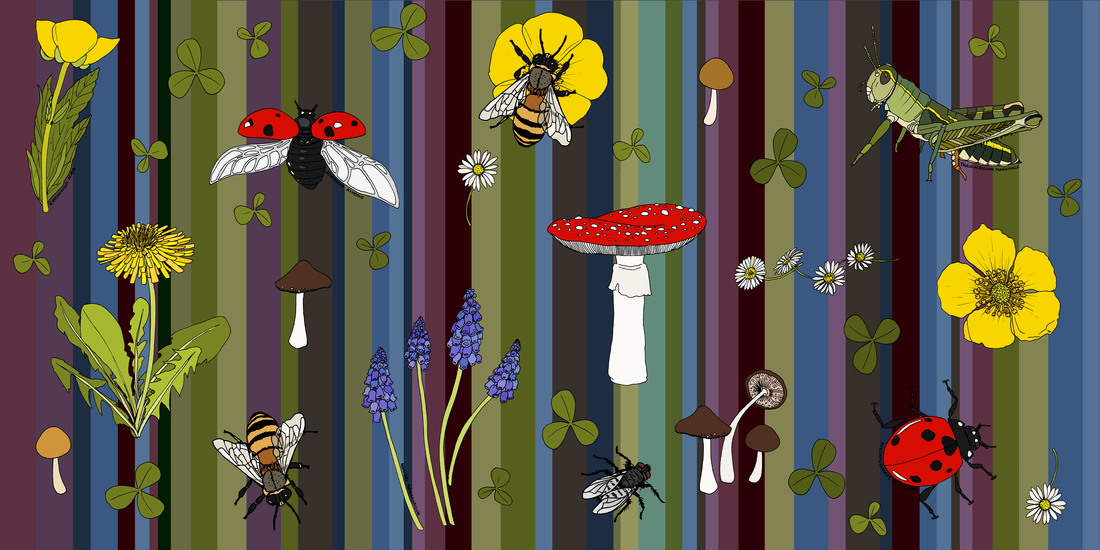
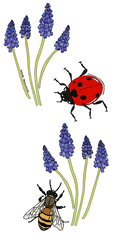
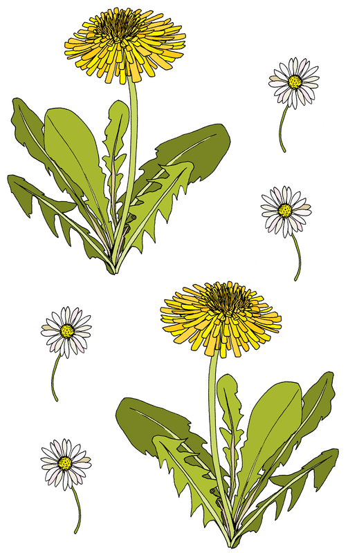
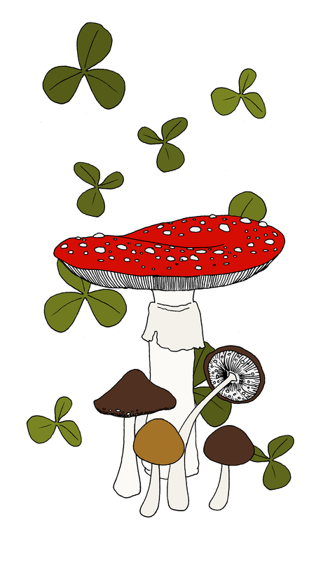
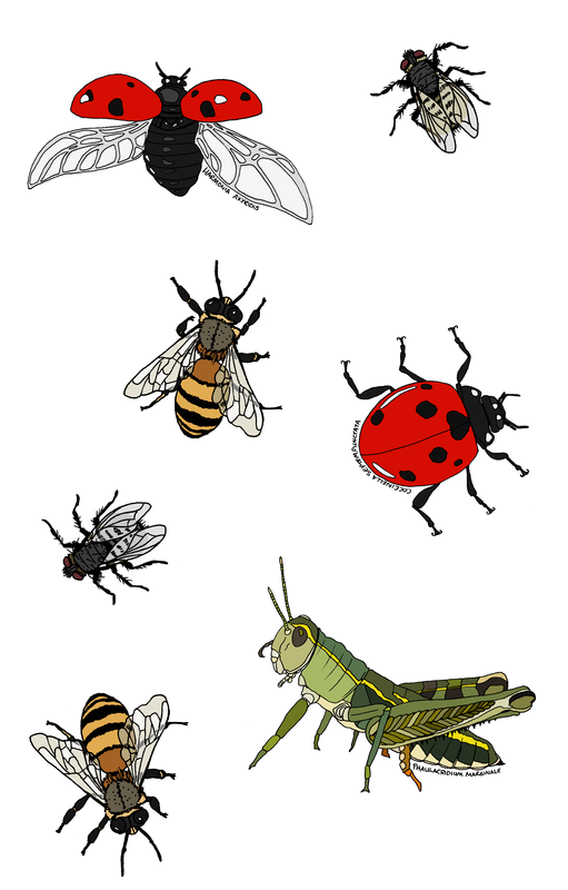
Many of my designs are inspired by our beautiful home up here in the Western Hills, in our own micro-climate, away from the rest of the Hutt Valley. The idea for the ‘meadow’ theme came from all the lovely flora and fauna with which we are surrounded. I also keep being asked to incorporate more reds into my designs, so that drove the inclusion of the amanitae muscariae and the ladybirds. I wandered around the property for some more inspiration, and it came together really nicely.
Meadow is available in all of my product lines – click the link below to shop by this new design!
Posted on Leave a comment

Sharkstorm!

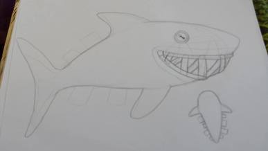
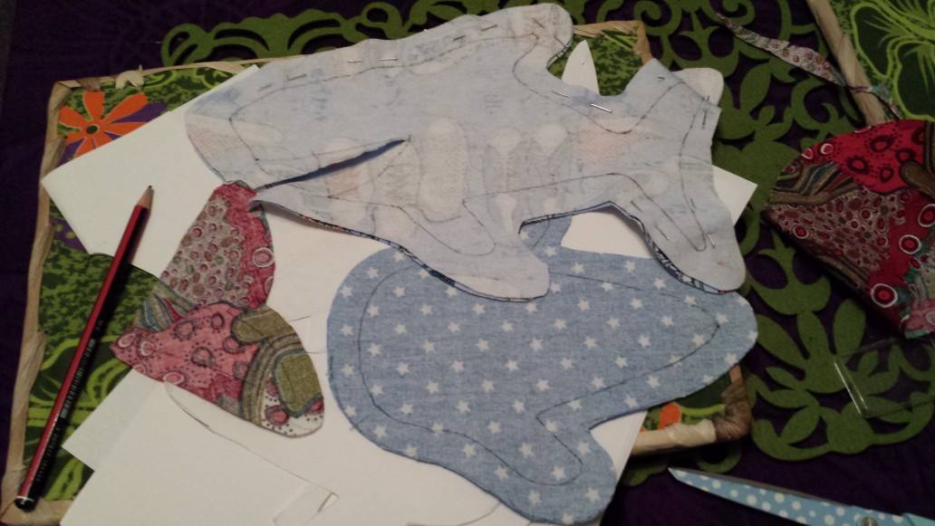
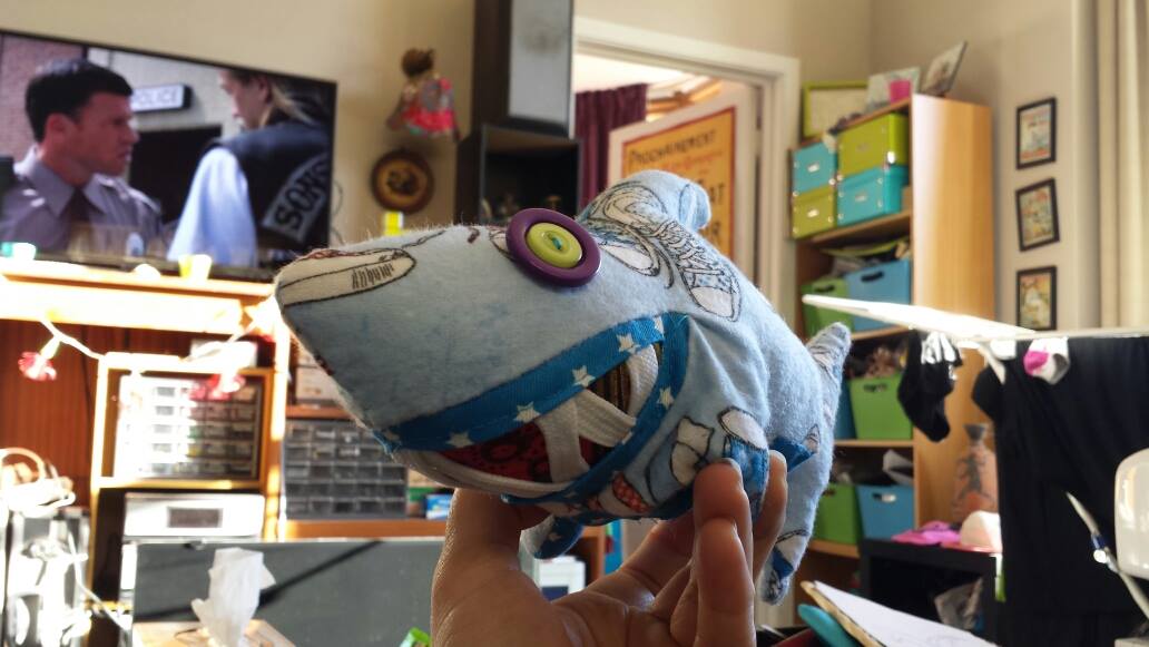
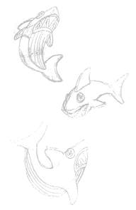
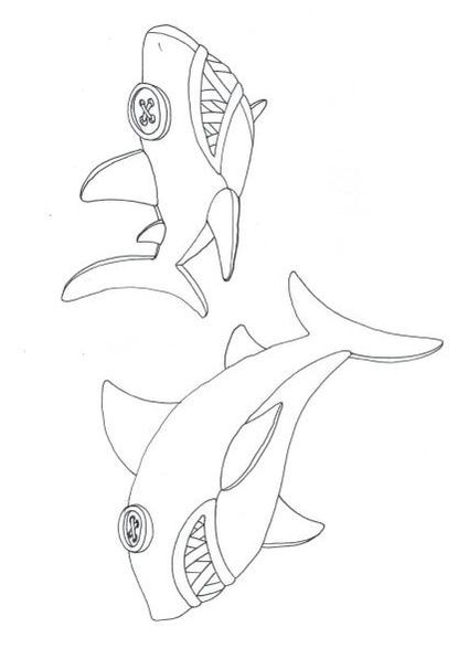
Back in September 2013, I decided to make a soft-toy shark. I was enjoying my life in my tiny, colourful flat, spending most evenings crafting and watching wonderfully terrible movies (most of which involved sharks), and I had a delicious new nephew for whom to make something cool.
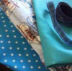
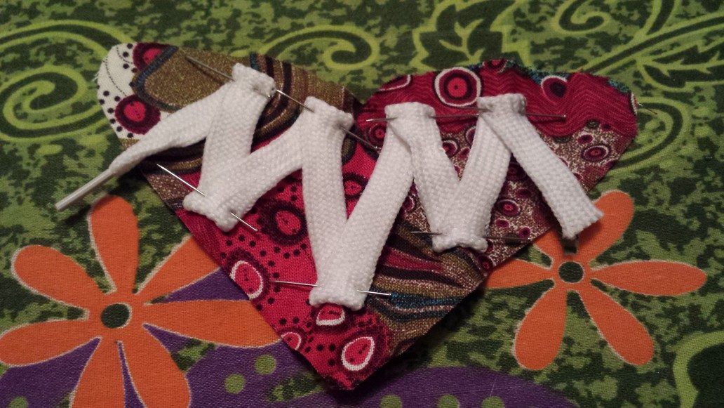
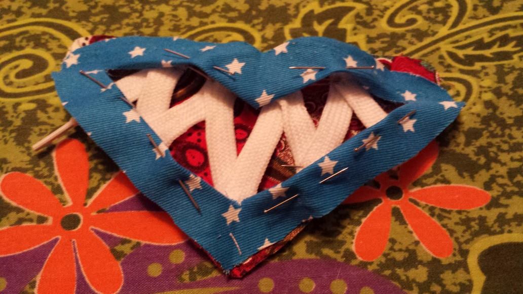
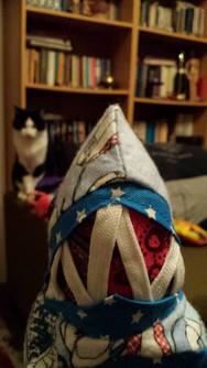
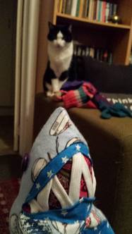
I themed my shark design around Chuck Taylor sneakers – his name is Charlie – so I used some cool sneaker-patterned fabric, and shoelaces for the teeth.
As the design evolved, I realised that it wasn’t actually suitable for a newborn – but it was a great deal of fun to make!
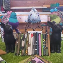
Fast-forward past the launch of Copper Catkin, with fat quarters for sale on my stall, I needed a few soft toys as examples of what you can make with small amounts of fabric – it’s not just for quilting! My shark (and my two soft-toy mudskippers) stepped into the limelight to entertain and amuse.
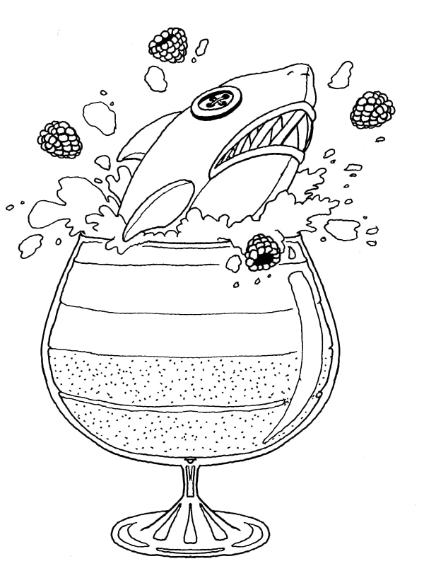
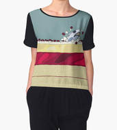
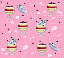
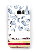
Not long after the shark began to accompany us regularly to markets, my baby niece arrived. To connect her design to her older brother’s, and because she was born around Christmas, I made her a trifle shark fabric design. I added a sharkstorm element because I was (still) obsessed with Sharknado.
And now, the design is available in fabric, jewellery, custom-printed accessories, and more 🙂
Posted on Leave a comment

The Underwater Unexpected

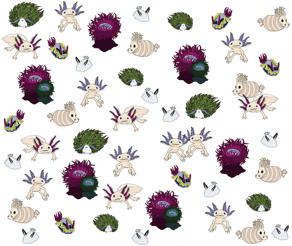
The Underwater Unexpected collection was the third winner of my ‘inspiration’ competition, just over a year ago. This has been one of my most successful designs EVER, so I thought its anniversary was a good opportunity to talk a little about its origins. 

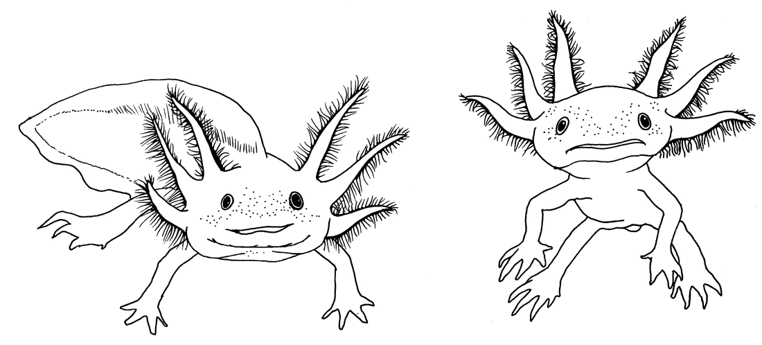
Some time ago, a friend-of-a-friend was selling her beautiful creations to raise funds to pay vet bills for her bunny. We ended up becoming friends, and I have greatly enjoyed her posts about her bunnies, succulents… and axolotls! So when Beka suggested that I draw axolotls as a fabric design, I knew it was a winner. They’re weird, they’re recognisable, and they’re fun to draw.

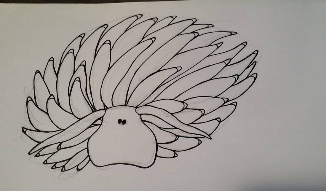
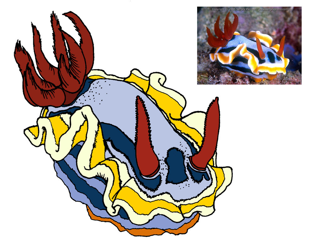
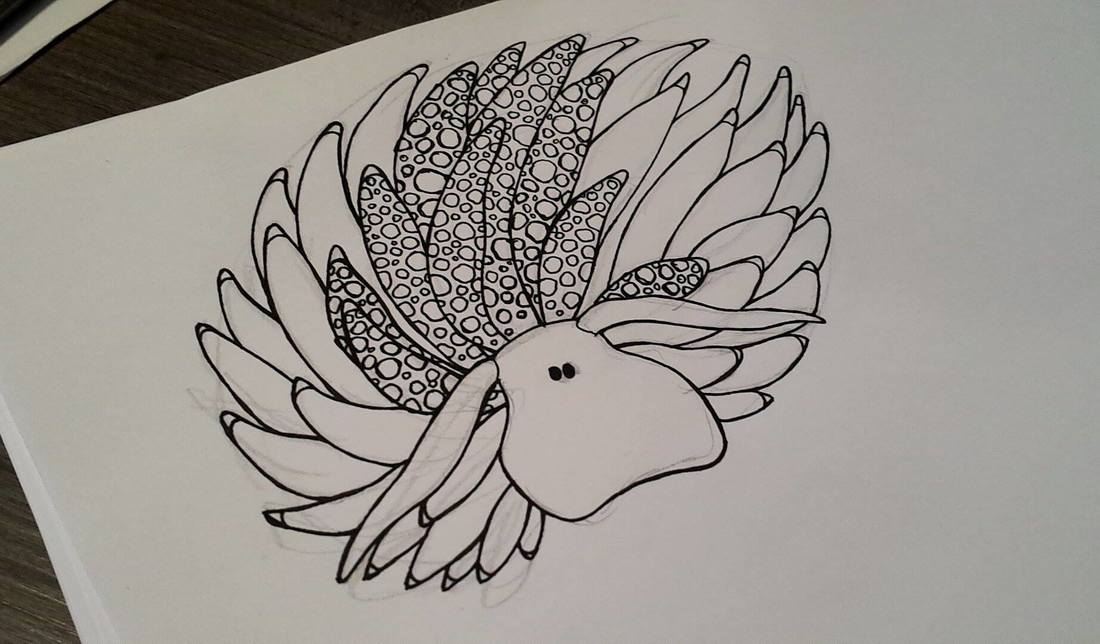
As a fabric design, though, they needed something else. Beka began suggesting some really wonderful, bizarre sea creatures – and I got drawing!
During the design process, I decided that I needed to make my own plaid background – and that turned out to be a great decision! The axolotl print remains one of my top sellers, and my biggest ‘wow’ moments for customers. Thanks, Beka! 😀
Posted on Leave a comment

Plaids and Stripes

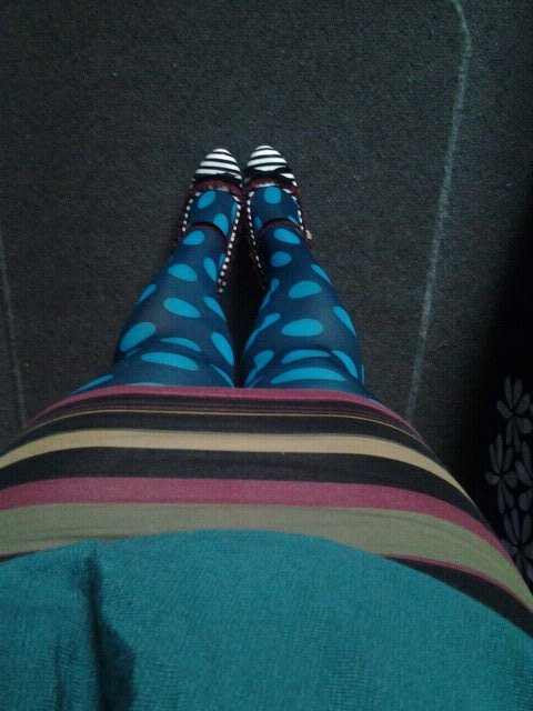
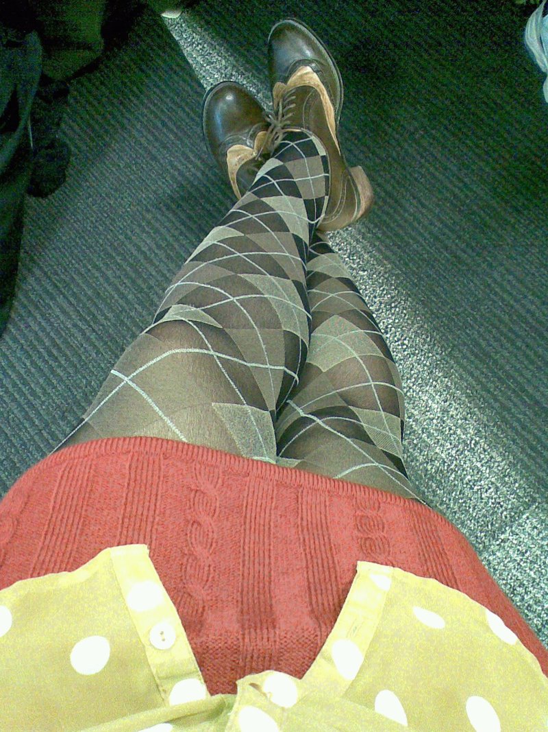
Plaids and stripes have always been an important part of my personal design aesthetic, especially when I mix patterns in the same outfit.
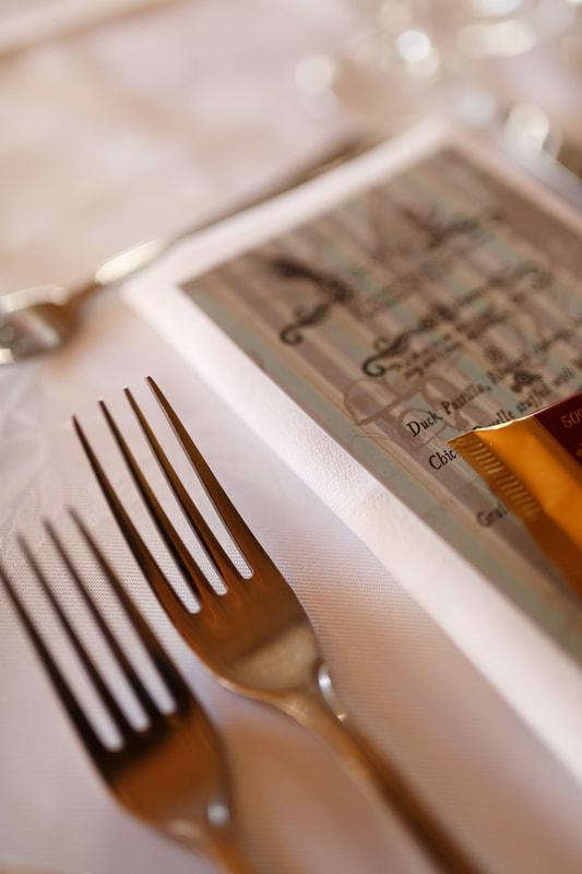
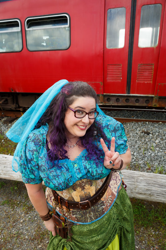
I carried my quirky colour scheme into my wedding outfits, too, including designing the invitations, and the fabric for my reception blouse.
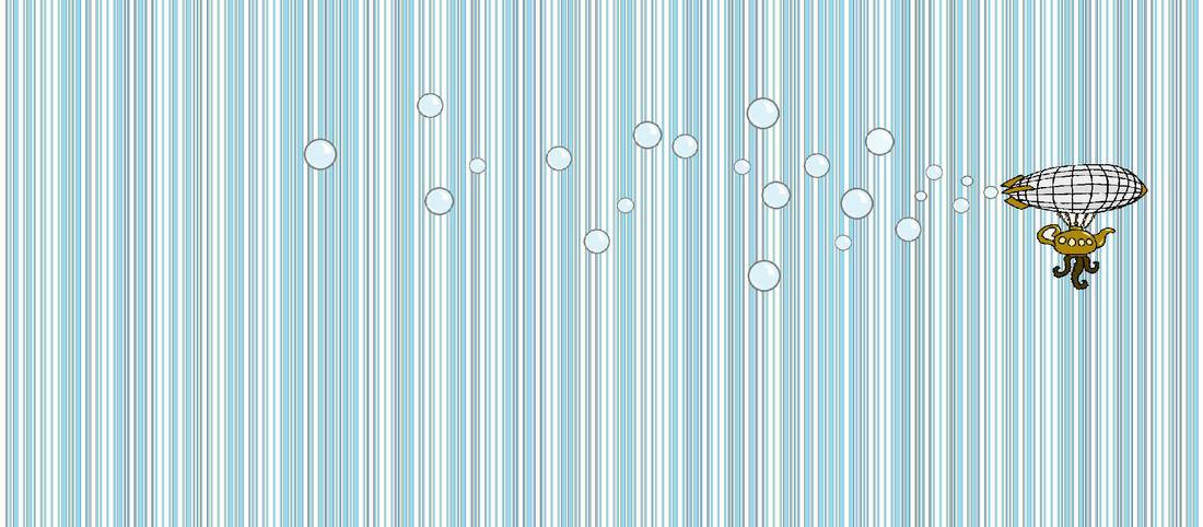
​​Stripes came into my fabric designs when my clever husband suggested that I use barcode font to spell ‘Drayer Steampunk Wedding’, which I used to create the stripe that was used as the background for our ‘thank you’ artwork after the event. 
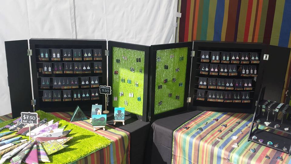
After the concept of the barcode stripe took hold, I used it to design a whole series of stripes, including my signature retro stripe which now decorates my fancy gazebo
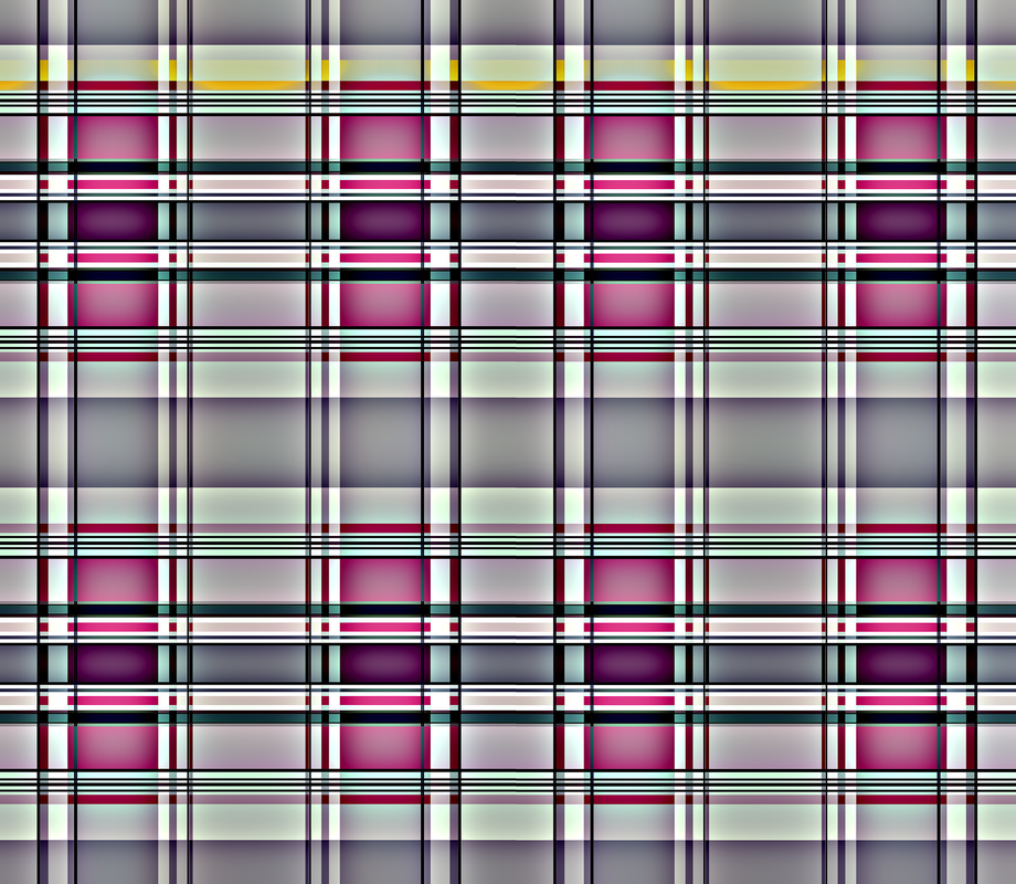
​I wanted a plaid background for my designs – so I made one, in order to avoid accidentally using an actual tartan.
Posted on Leave a comment

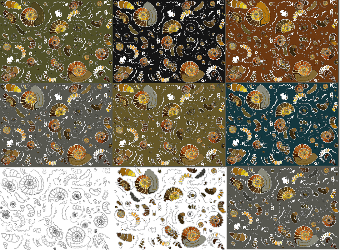
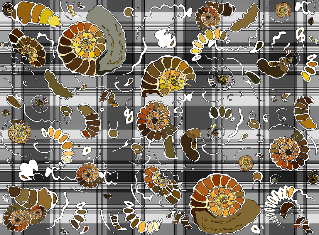
Fossilised Ammonites Fabric Design

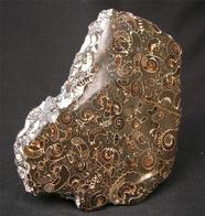
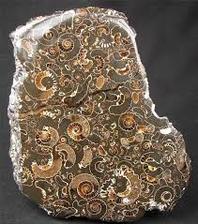
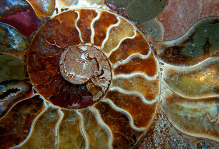
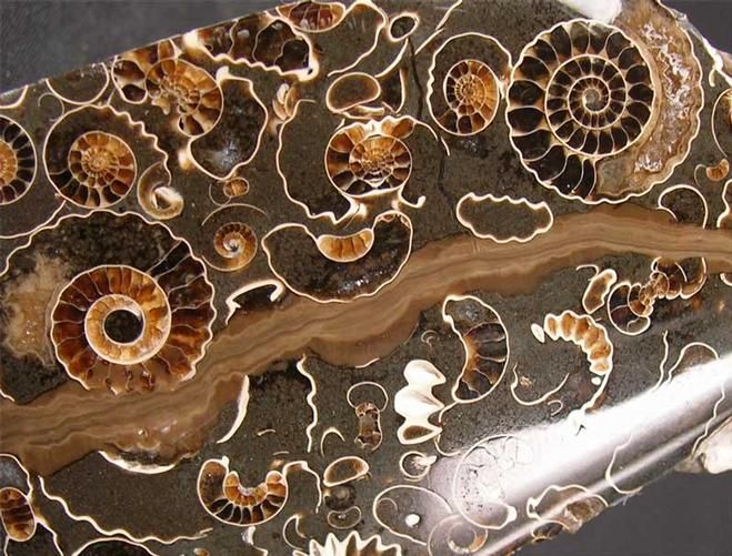
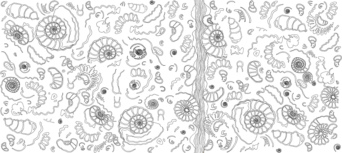
I was scrolling through Facebook last year, as you do, when an amazing photograph of an amazing rock crammed full of fossilised ammonites appeared in my news feed. I just *knew* that I had to draw it! I Googled for inspiration photos, and soon, I had enough to get me started.
It turned out to be quite difficult to replicate the look of the fossil in my simple, flat-colour-and-black-linework style, but it was really satisfying to achieve – and it makes a great fabric design!