The background
An American friend of mine has been struggling through some pretty tough times recently. She’s dealing with serious family illness, and all the horrible internal politics that go with it. I’ve been watching developments helplessly from here in NZ, wishing there was something I could do – but there simply wasn’t anything more than giving support through the internet.
She comes from a place called
Lake Havasu, Arizona. A local publication there runs a column called ‘
orchids and onions‘, where residents can express their gratitude or vent their frustration by assigning orchids or onions to someone. Since she has been back home with her sick relative, she has used the format in her own Facebook posts, and it caught my imagination – mainly because I have a tendency to have a black thumb, and no meal I make is complete without at least one member of the onion family! It’s rather a lovely motif, though, and the imagery kept coming back to me as I thought about what might be a nice thing to cheer her up.
Although the orchids represent the positive, and the onions the negative, I chose to combine them in a philosophical “when life gives you lemons”-style design. You take the good with the bad, and you try to make something pretty out of it anyway. That’s kind of her signature move. She’s a tough chick, and she handles a lot of difficult things without losing touch with what makes it all worthwhile.
I wish that I could share some photos with you of her lovely home – she has been doing an inspirational job of decluttering her life, and her carefully-curated home reflects her efforts beautifully. As a result, I know of her passion for teal turquoise shades, and her love of orchids – so I had both subject matter and colour scheme covered. I hope very much that my designs will fit with her aesthetic!
The design
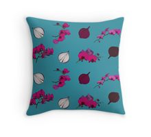
After consulting my friend’s husband, we decided to go ahead with a design to match one of her favourite orchids on a teal background, and that I would send it to her on one of
Redbubble‘s throw pillows – so I got started with a plan in mind.
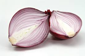
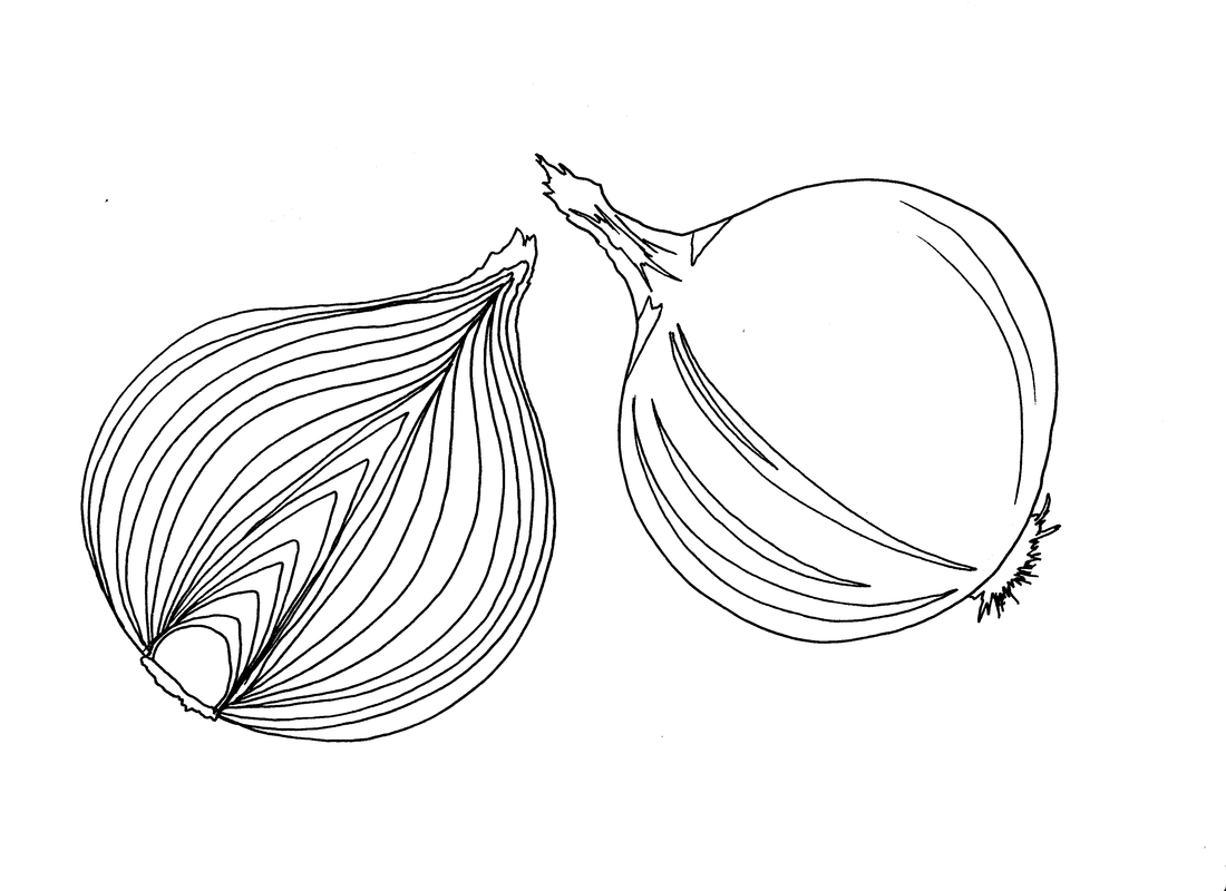
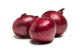
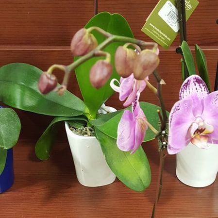
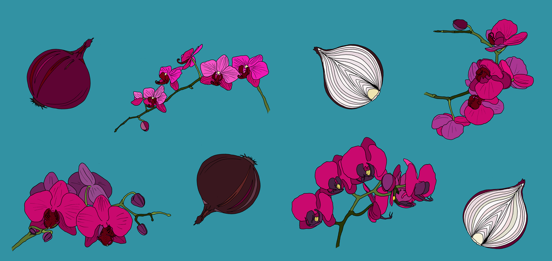
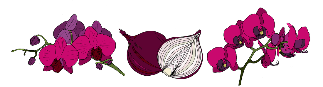
Onions posed no challenge – I have drawn them many times, and as most people would be, I am intimately familiar with their structure, so the only thing I needed to do was decide what kind of onion to draw, and what colour. I settled rapidly on red onions, to go with my friend’s favourite orchid (photo credit to her husband).
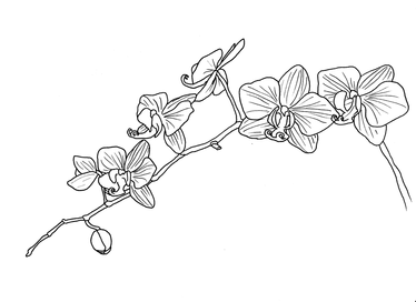
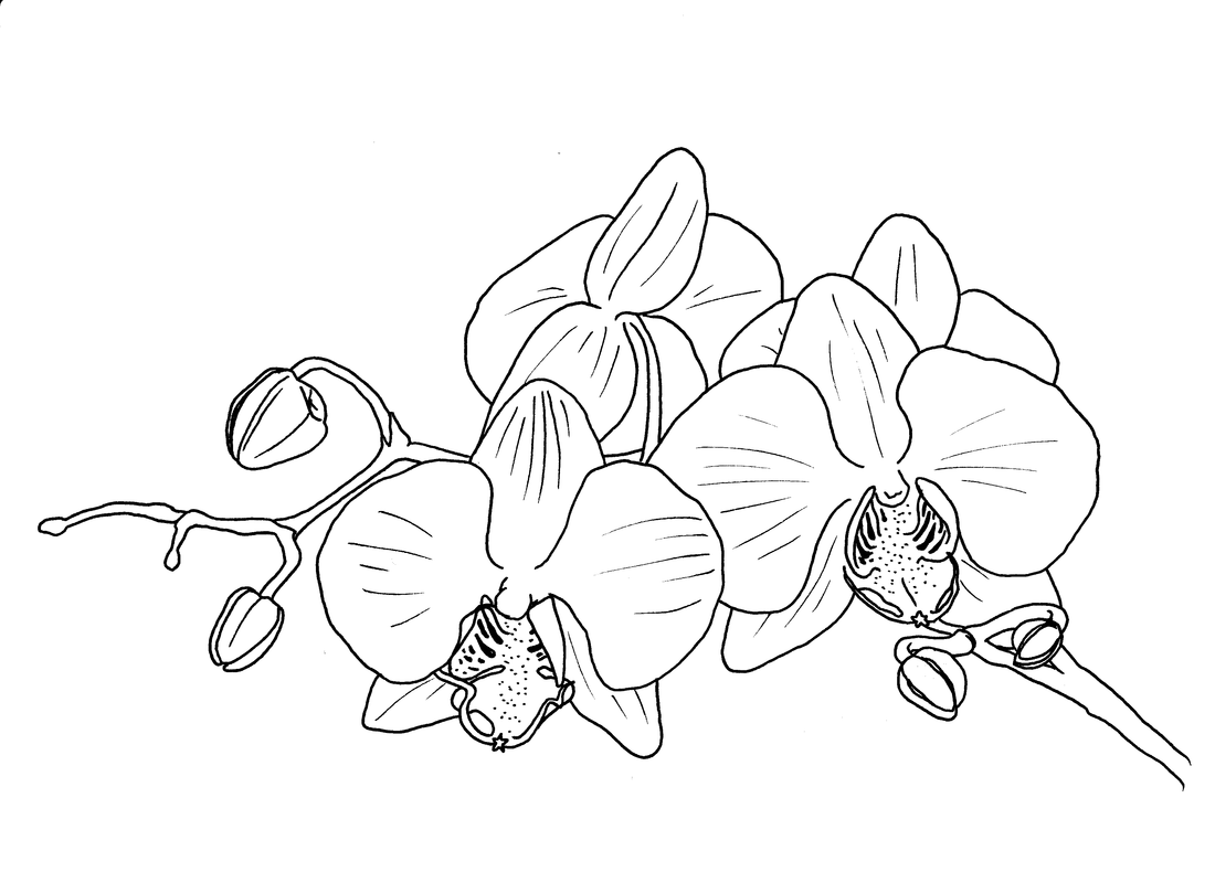
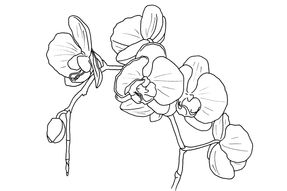
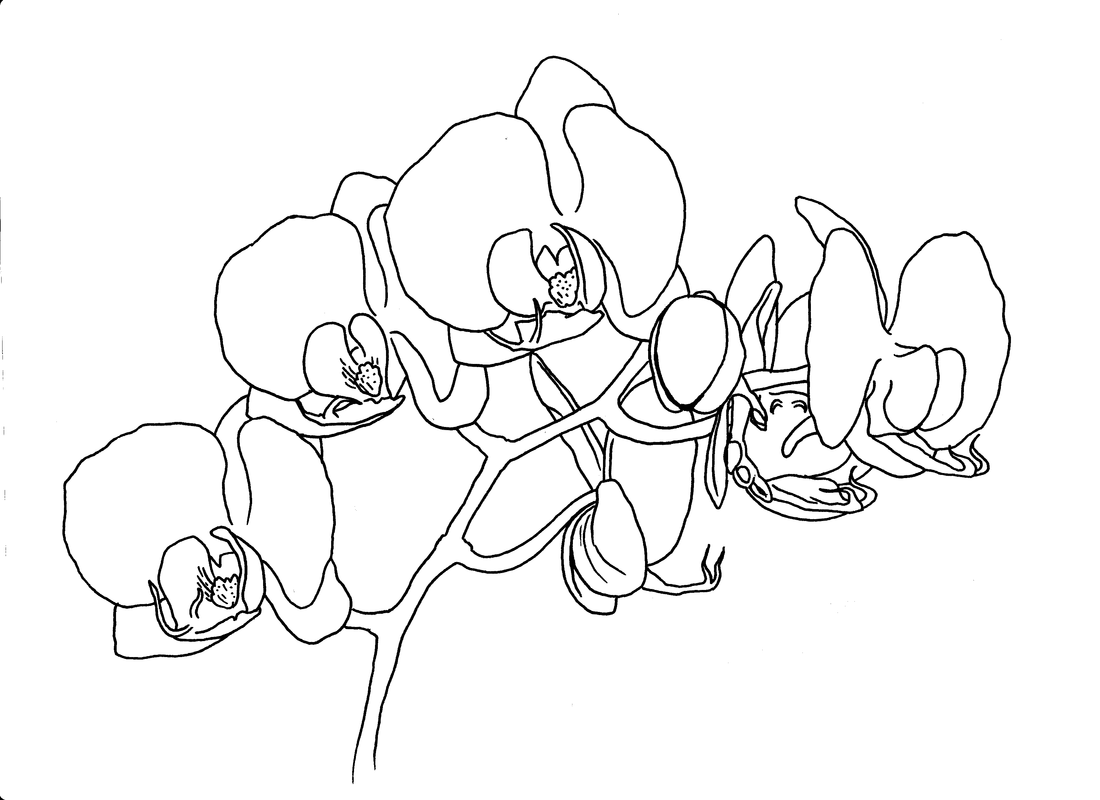
After a lot of research and practice (including actually tracing some photos to try to learn more about how the flowers worked), I managed to gain enough of an understanding of the structure of the orchid flower to make some decent sketches, and the design evolved rapidly from there.
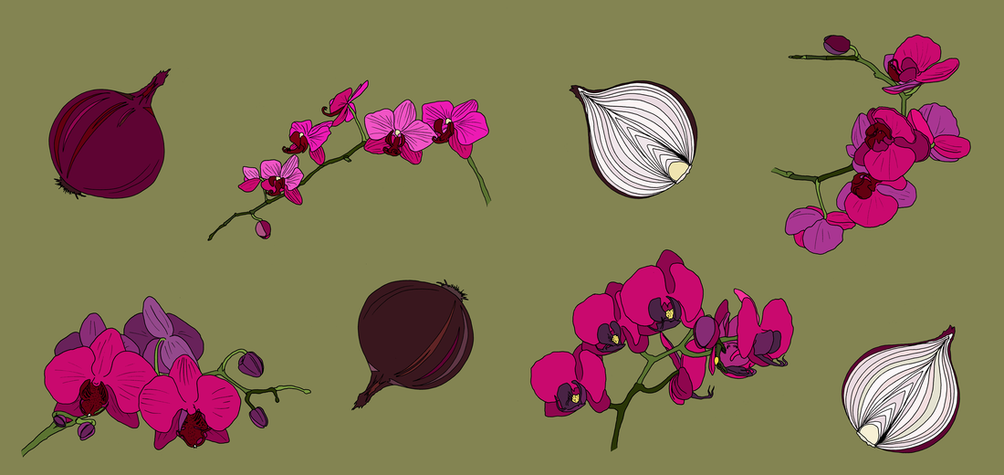
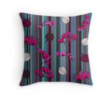
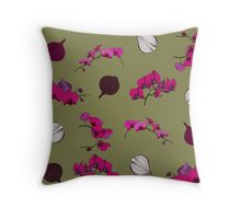
Once the colours started to work, the design really came together quickly. I couldn’t decide on the best background colour, though! The turquoise is wonderfully lurid – but what if it’s not the right shade? But the moss didn’t quite pop enough…
The end result
Once I used the
Redbubble mock-up feature, it became abundantly clear that the turquoise was the best choice. I decided to give her a set of two cushions, and as a result, I now also have a new stripe in my arsenal – win/win!
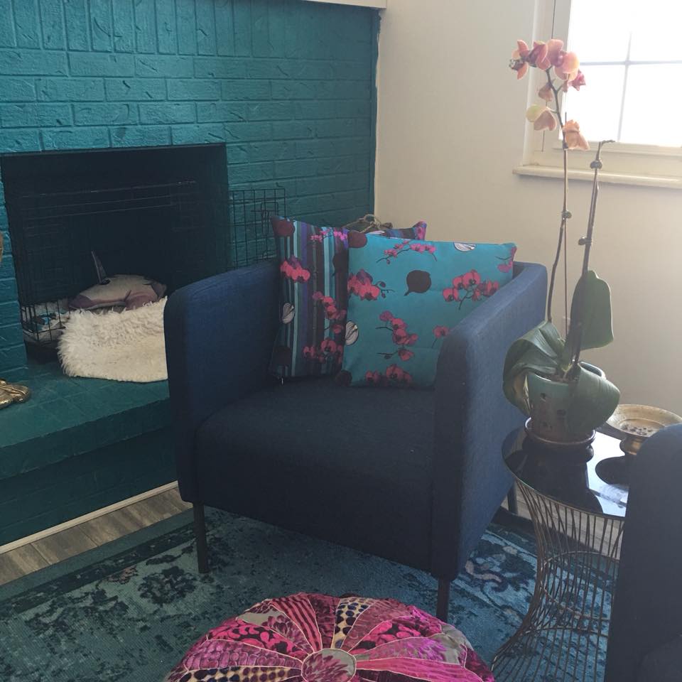
The cushions are already winging their way to her place as we speak – one of the things I love the most about working in the digital medium! A day’s work and a site like
Redbubble, and custom-printed cushion covers can appear on the doorstep of a friend to give her the comfort that I can’t give from the other side of the world.
UPDATE: They’ve arrived!!! And they look amazing!